LG’s G3 GUI
Issue: XXII.1 January + February 2015Page: 12
Digital Citation
Authors:
Chul Lee, Kunho Lee

Describe what you made. The G3 is LG's newest flagship smartphone, launched at the end of May 2014. Here, we share the design story of the G3 graphical user interface (GUI). Most of LG's smartphones are built based on Android OS. It's very important for us to provide users with a unique user experience yet not spoil the basic usability of Android. The G3 model also respects and reflects the basic framework of Android, but we made quite a few changes to give the GUI a unique feel and a harmonious balance between usability and sensibility.
Describe the process of how this was made. Before the G3, we applied realistic graphics such as shadows, gradations, and material effects to show off the excellent picture quality of LG's display. But one day we became aware that we had been overlooking the user experience and were wasting our time and effort adding excessive details and fancy graphics, which were blinding the users. So we decided to redesign the entire GUI with a simple style, getting rid of the unnecessary decoration and visual clutter. We were confident this change would help users focus on the important thing: the content. As a result, the overall memory requirements for graphics were reduced, leading to performance enhancements that eventually made it possible for users to access their content even faster. The system memory, which was loaded with heavy graphics, can now be used more meaningfully for user memory, which people can employ according to their needs.
Of course it wasn't an easy journey. People at LG were used to the realistic, decorative, fancy graphic style and weren't ready to accept this change. They were especially concerned that the flat design would be too dull and blunt to show off the excellence of a high-resolution (QHD) display. Through a long, persistent effort, we persuaded them that the restrained beauty of this "new wave" GUI was the way to go.
What for you is the most important/key/interesting thing about what you made? As a GUI design team, the biggest challenge we faced was our mission to "create the most appealing GUI with an exquisite balance of unique LG style aligned with the hippest graphic trend"—and, of course, to create a design that was meaningful to users. First, our style shares in the mega trend in design that big corporations such as Microsoft, Apple, and Google have been adopting lately. We call this trend the new wave of digital modernism. Throughout design history, style shows a pattern of periodic shifts between ornamentalism and functionalism. GUI design for digital devices has also evolved in a similar pattern—of course, the speed and cycle of these changes are beyond compare. Skeuomorphic graphic UIs mimicking the real world are now evolving in a more symbolic, simple direction; the G3 is swimming with the tide of this digital modernism.

Second, in order to create a unique visual style for LG the circular shape from the LG logo was used as a main graphic motif. Through harmonies between circular forms and the grid, we gave accent and rhythm to the overall layout.
Was this a collaborative process? If so, who was involved? This definitely was a collaborative process. Hundreds of UI designers and software engineers were involved. Software engineers helped us resolve the limitations and issues that designers could not solve. Here is one example:
Designers wanted to apply a light, crisp typeface that could show beauty and rhythm through typography, but this typeface had legibility problems depending on the background image. To resolve this issue, designers and software engineers came up with an algorithm that changes the text color adaptively based on the analysis of the brightness and complexity of the background image. Designers came up with an idea that looks cool; engineers helped to actually make it happen. What a team!
Skeuomorphic graphic UIs mimicking the real world are now evolving in a more symbolic, simple direction.
We also collaborated intimately with industrial designers from the early stages of the design process to create a harmony between hardware and software design. The KnockOn feature that began with the G2 was an idea that originally came from the rear key of the hardware design. And in the G3, we took another step forward and gave it an even more sophisticated user experience, combining the Knock Code with security functions.
Only when interacting with the user does the GUI design become a complete product.
Knock Code has reduced the steps for turning on the screen using pattern lock into one step. It's easy to control with one hand and it has enhanced security. Using 3- to 8-step combinations there can be up to 86,367 code patterns. This can also be seen in the numerical passcode; the 8-digit passcodes of Knock Code are up to 8 times more secure than the basic 4-digit passcodes.
What expertise (skills and competences) did it require? This applies to most design, but GUI design especially should not focus only on aesthetics. The graphic design must first be applied to the UI structure and then transformed into software code; finally, only when interacting with the user does the GUI design become a complete product.
To create a meaningful design for the users, all icons, buttons, and components were designed according to how they were to be used and which tasks flow through them. For this, designers needed to have a deep understanding of the overall task flow, the information architecture, and especially the user scenario. We also needed to optimize the graphical resources and animation sequences in order to minimize delay during use. To do this, the designers were required to understand and utilize the basic structure and code of the Android OS.
Did anything go wrong? We originally planned to apply more transition effects and animations. Since the graphics were transformed into a more flat and simple style, we wanted to make sure the affordances and hierarchy were visualized by various animation effects. But unfortunately we had to eliminate many motion effects right before launch because they could not pass the performance standards of LG's quality assurance (QA) process. This was because we did not have enough time to optimize the final software. It is a pity we will now have to wait until the next model to apply these interaction designs. Adding these elements will hopefully provide more intuitiveness and emotional satisfaction.
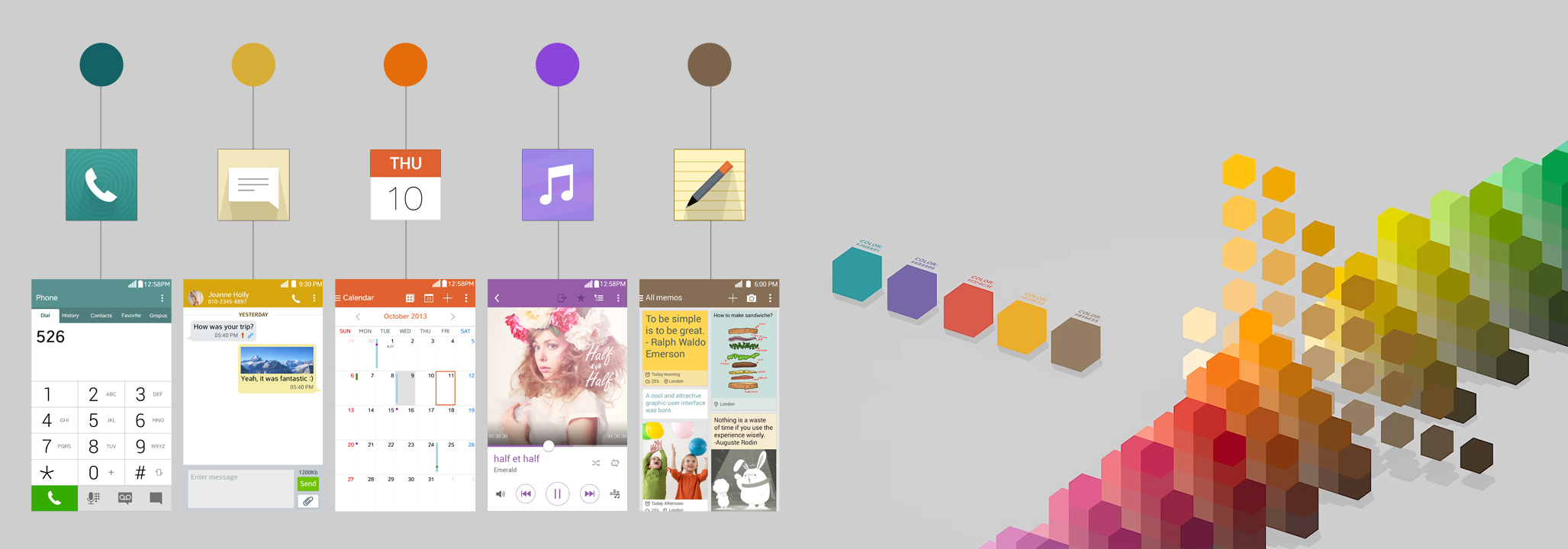
Was there anything new in the making, process, materials, or anything else that you can tell us about? "Design the ordinary extraordinary, and make the unusual usual" is our team's motto. There are some characteristics of the G3 that are not completely new but are newly interpreted. First, minimalistic graphics, which help users concentrate on the content. We got rid of all visual clutter with clean, flat graphics. Second, exquisite iconography. Maintaining the same metaphor applied in previous models, we kept the legacy and consistency of LG's GUI style but gave it a twist by flattening out the icons. The icons were sketched and designed based on the golden ratio grid system, rooting them in traditions of craftsmanship. Third, the color scheme. Avoiding bright primary colors that are painful to the eyes, we used toned-down colors to give a more elegant look. Beyond just being aesthetic, colors are used as a cognitive factor. The five major apps are designed in five different colors, which lets users intuitively notice which app they are using and avoid getting lost. Last, flip animations. Through simple, amusing motion effects, we added vitality to the flat 2D graphics and increased usability during interaction.
What is the one thing about making this that you would like to share with other makers? It was a pretty nerve-racking experience waiting for the customer feedback after launching the G3. But our nervousness soon changed to anticipation when we started receiving positive feedback from expert magazines and review sites. Our anticipation and conviction increased when we got a positive review from a website with a well-known reputation for being friendly-to-Apple and hostile-to-Android smartphones: "G3's GUI is very clean, sophisticated, and well refined."
G3's GUI is receiving strong positive reactions from the Korean and U.S. markets. And we were honored with a "Best of the Best" award by Red Dot Communications in 2014. But this is not the end of our journey. We will continue to find the essential value for customers by offering them the proper GUI. We will keep calm and carry on.
Authors
Chul Bae Lee LG Electronics [email protected]
Kunho Lee LG Electronics [email protected]
Figures
 Figure. Icon sketches.
 Figure. Screen layout and flow chart.
 Figure. Ideation session.
 Figure. Motion prototyping.
 Figure. Colors are used as a cognitive factor.
 Figure. Various wallpaper images matching the exterior colors.
 Figure. Senior Designer Kunho Lee (left) and VP Chul Bae Lee explaining how the G3 icons were created.
Copyright held by authors
The Digital Library is published by the Association for Computing Machinery. Copyright © 2015 ACM, Inc.