Designing Data Physicalization Artifacts
Issue: XXX.3 May + June 2023Page: 14
Digital Citation

Authors:
Marijel Melo

As opposed to 2D-rendered data representations that are solely visual, data physicalizations are 3D representations of datasets that can be touched, heard, and even smelled. The ethos of 2D data visualizations is touted in the simplicity of their portrayal: clean lines, minimal images, muted colors, and an aura of what Donna Haraway calls the God-trick—the idea that the visualization offers an unbiased, objective representation from an "all-knowing" author [1]. A common assumption is that data visualizations are objective; however, notions around objectivity and the "hygiene" of visualizations are called into question from a critical standpoint.
The design of 3D datasets allows for critical reflection on the performative nature of data visualizations and how they contribute to larger conversations about power.
While data physicalizations have existed since time immemorial, the design of 3D datasets allows for critical reflection on the performative nature of data visualizations and how they contribute to larger conversations about power. For example, data and the researcher are often invisibilized in a chart or graph. What would it mean to have the researcher extend their positionality into the data representation? To recognize the limits of objectivity and instead strive for transparency regarding how the visualization was created [2]? To showcase the limits of the dataset?
I teach a course on critical making and assign a data physicalization project. I ask students to reenvision their relationship to a 2D dataset by creating a 3D artifact based on that dataset. Specifically, students were asked to consider the ethics and politics of data visualization through critical lenses (e.g., race, gender, sexuality, class). The students chose their dataset topics; the subjects were diverse: the harms of masking in the LGBTQ+ community, the impact of banned books on user communities, and land loss on Turtle Island and Indigenous resistance. Students designed rhetorically persuasive data physicalizations with an accompanying strategic rationale to outline their making processes.
Presented here are two examples of students' artifacts and their making processes.
1. Holes in the Data: A Representation of LGBTQ Data
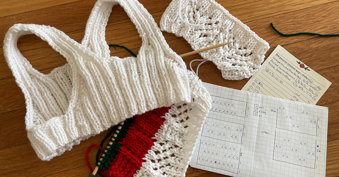
For the physicalization of this data I have knitted a mesh tank top, using different stitch patterns and colors to represent different elements of the data. I chose a mesh tank top as a queer item of clothing that plays with aspects of concealing and revealing, which reflect different approaches to collecting queer data. Each band of color represents a different point of data. The holes in the pattern symbolize the fact that there are gaps in LGBTQ data collection (what is unknown about LGBTQlives captured by data) even as they reveal the body underneath.
—James McKinnell
2. Unbearable Ugliness
The purpose of this project is to capture the reactions of many devout Catholics to the data presented by Report 1 of the 40th Pennsylvania Statewide Investigating Grand Jury, 2018. Through this, I hope to bring greater awareness to the sexual abuse crisis in the Catholic Church and to remind viewers to be critical of all organizations.
—Maria Palmtag
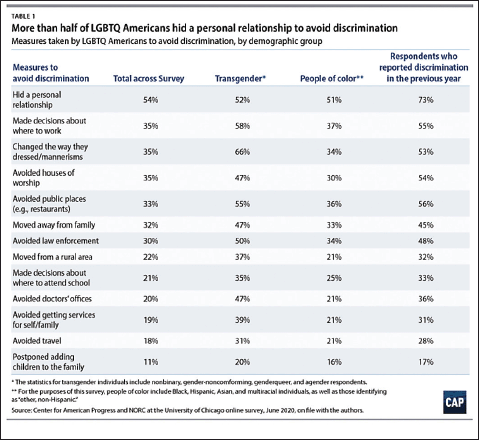 | 1. Dataset from the Center for American Progress and NORC at the University of Chicago, 2020. |
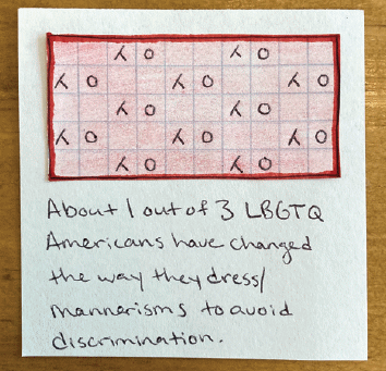 | 1. A stitch chart to represent a data point on LGBTQ dress and mannerisms. |
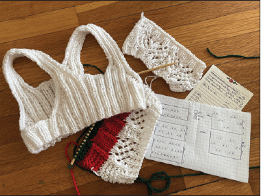 | 1. Working draft of the mesh top. |
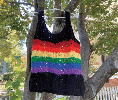 | 1. The finished data physicalization artifact. |
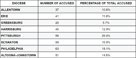 | 2. Table from Report 1 of the 40th Pennsylvania Statewide Investigating Grand Jury, 2018. |
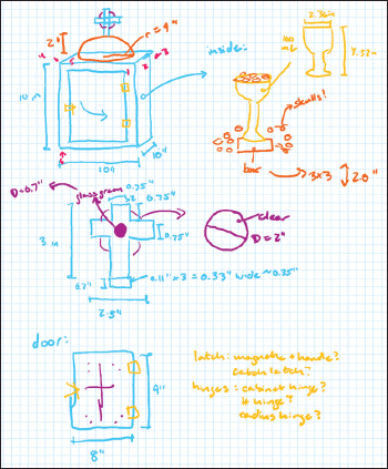 | 2. Sketch of the artifact's dimensions and components. |
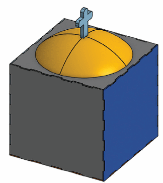 | 2. 3D model prototype rendered via Onshape. |
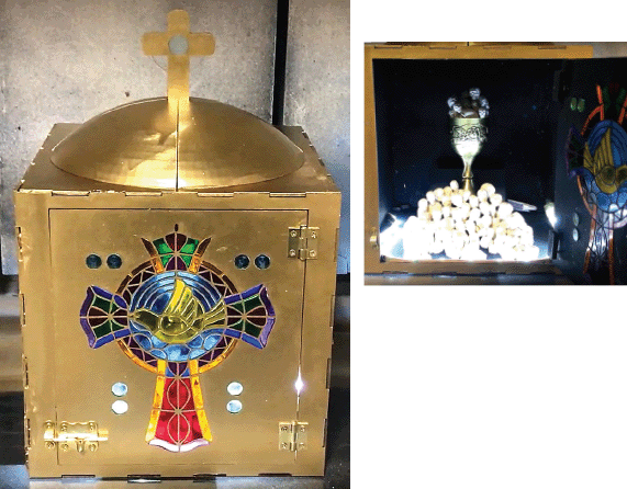 | 2. The finished data physicalization artifact. |
References
1. Haraway, D. Situated knowledges: The science question in feminism and the privilege of partial perspective. Feminist Studies 14, 3 (1988), 575–599; https://doi.org/10.2307/3178066
2. D'Ignazio, C. and Klein, L.F. Data Feminism. MIT Press, 2020.
Author
Marijel Melo is an assistant professor in the School of Information and Library Science and director of the Equity in the Making Lab at the University of North Carolina at Chapel Hill. [email protected]
Copyright held by author
The Digital Library is published by the Association for Computing Machinery. Copyright © 2023 ACM, Inc.