How was it made? WiFi impressionist
Issue: XXVII.2 March - April 2020Page: 14
Digital Citation

Authors:
Richard Vijgen

Describe what you made.
We are literally surrounded with data. Thousands of wireless signals from cellphones, computers, and various digital infrastructure fill the space around us with information. Through our devices we can interact with this ethereal world but we can never see it, touch it, or experience it directly.
In my work I am interested in visualizing these abstract and disembodied realities. In 2015 I created the app Architecture of Radio, which visualizes the digital signals around us. Though compelling, the work is a theoretical visualization. A mobile phone or tablet does not have the hardware to detect the origin of a radio signal in space. This limitation became the starting point for WiFi Impressionist. Would it be possible to make a visualization of the actual signals around me by measuring them rather than by relying on a database with geo-coordinates?
 |
Architecture of Radio app, 2015. |
Just like a painting of a landscape is an interpretation of electromagnetic vibrations (color), so too is radio.
Briefly describe the process of how this was made.
As a first step, I connected a directional Yagi antenna to a WiFi receiver to see if I could determine the origin of a signal in space by moving the antenna around and measuring signal strength. This proved quite successful. As a next step, I mounted the antenna to a pan-tilt mechanism controlled by a Raspberry Pi. With this setup, I was able to position the antenna precisely in 0.5-degree steps and record signal strengths in relation to the orientation of the antenna. Next I used Pcap, a packet-recording API that allowed me to pick up all the signals around me and differentiate between sending and receiving devices. Once the pan-tilt mechanism had completed a full scan (360-degree horizontal and 90-degree vertical) and all the data was recorded, I was able to make a three-dimensional map of the signals around me. While I liked this image visually, I found it was too direct as a representation of the WiFi signals.
 |
Experimental setup: Directional antenna on pan-tilt mechanism. |
What for you is the most important/interesting thing about what you made?
I was looking for a way to represent the measurement data in relation to the location where they are measured, pretty much like a painter would sit down in a field with a canvas on an easel and paint a representation of the view. I took this analogy literally because I felt it was helpful in achieving my goal of imagining WiFi as a landscape of radio signals. Just like visible light, radio is a part of the electromagnetic spectrum. And just like a painting of a landscape is an interpretation of the electromagnetic vibrations (color), so too is radio, albeit in a different range of the spectrum.
 |
WiFi Impressionist field installation, Arnhem, the Netherlands. |
What is the one thing about making this that you would like to share with other makers?
I didn't want to make a "black box" where an image just appears after a while (like a jpeg on a screen or a digital print). So I used a mechanical plotter, as it allows you to slowly build an image in a way that is understandable—you can follow the process. Unlike a digital image on a screen, it is very close to a human hand drawing what is in front of it.
 |
WiFi Impressionist field installation, Rotterdam, the Netherlands. |
 |
Process: Spherical signal visualization. |
 |
Drawing, Rotterdam 2019. |
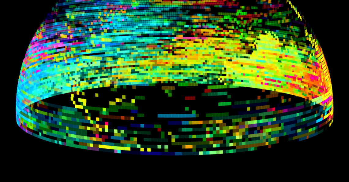
 |
Back-end: Visualization of the spherical model used by the software. |
Author
Richard Vijgen, Studio Richard Vijgen, [email protected]
Footnotes
http://www.wifiimpressionist.com
Copyright held by author
The Digital Library is published by the Association for Computing Machinery. Copyright © 2020 ACM, Inc.