


Authors:
Niklas Elmqvist

Understanding data has become critical to everyday life. You need data to decide which products to buy, which health choices to make, and whom to vote for. People spend hours reading product reviews, browsing travel websites, and managing large amounts of data to make decisions in their personal lives. But what if you personally didn't have access to this data?
Data-driven decision making is even more important in our professional lives, where many office and knowledge jobs require workers to possess data analysis skills to be successful. Fortunately, modern data analysis software, such as Excel, Tableau, and Power BI, place the tools necessary for such analysis into the hands of everyday users. But what if you didn't have access to those tools? Or what if the tools didn't help you complete your everyday tasks?
Insights
→ The academic visualization field has largely ignored accessibility for most of its history; it is time that it learned from the accessibility field.
→ It is the spatial rather than visual nature of visualizations that make them useful for blind individuals.
→ Using a visual (and spatial) representation as common ground facilitates collaboration between blind and sighted individuals.
Data analysis is one of the most challenging activities that today's computer users can engage in, especially for nonexperts who don't have the time, resources, or knowledge to develop the associated skills. Using data visualization to create interactive graphic representations of the data can serve as an equalizer by providing clear and understandable depictions that enable intuitive analysis and decision making.
But, again, you need the right tools, and not all tools are universally accessible. Specifically, if you are blind, visualization is nearly impossible to use. And even if you can access the raw data, which is far from a given, the massive scale of many real-world datasets means that effective overview is beyond your reach without expertise in statistics and data science.
While the accessibility field has long grappled with these issues, it is only recently that the academic data visualization community has realized the need for accessible representations of data. This is perhaps unsurprising given how foundational visual aspects are to data visualization research—the field has long taken 20/20 vision for granted—but it is time for a reckoning. In this article, I will review how the community so far has addressed this oversight and what needs to happen next for visualization to become a truly accessible medium.
The Need for Accessible Data
There are more than 250 million people with visual impairments in the world, more than 25 million of whom are fully blind. In fact, if we count near or distant vision impairment, that number rises to more than 2.2 billion [1]. Making data accessible also helps sighted users in the same way a rising tide raises all boats. This is an example of what accessibility advocates call the curb-cut effect, where improving the physical accessibility of sidewalks to benefit people with wheelchairs also benefits parents pushing strollers or people pulling heavy suitcases. Such effects abound in computing; for example, audiobooks and closed captioning were originally designed for people with disabilities (blind and deaf users, respectively), but are beneficial in many other situations and for any individual.
Making data accessible helps sighted users in the same way a rising tide raises all boats.
That blind individuals [2] need data analysis to the same extent as sighted individuals is obvious. Blind people are often underemployed and underpaid, so our instincts as HCI researchers and practitioners should be to reduce barriers and increase inclusivity to facilitate more just, equitable, and universal access to technology. What is perhaps less obvious is that blind people, somewhat paradoxically, are visual thinkers to the same degree as sighted people. Put differently, visual reasoning does not require vision. After all, we are all physical beings inhabiting and navigating the real world and we are all familiar with physical space. In fact, my group's recent work interviewing orientation and mobility (O&M) instructors [3]—the people who teach blind individuals how to navigate the real world—showed that the concept of visualization is familiar to virtually all their students, either from before becoming blind or from their professional and personal lives. Indeed, I hope that one of the outcomes of this article is for people to think of visualization less as being visual and more as being spatial.
My Story
While color vision deficiency has long been on the radar of the visualization discipline, accessibility in visualization has largely been promoted only by scholars such as Ed Summers, Aimi Hamraie, and Liz Jackson, and until recently was a rare topic at academic visualization conferences. The accessibility community, on the other hand, has long been discussing ways to make visual representations accessible not just to blind users, but also to people with other forms of disabilities.
It may seem odd for an entire scientific community to ignore a large group of potential users, but accessibility advocates will be less surprised. People with disabilities are often given short shrift or even actively discriminated against in technology circles, which means that legislation such as the Americans with Disabilities Act (ADA) is required to get companies and organizations to comply. To illustrate this lack of awareness, it may be useful to discuss my own story in accessibility because it shows how easy it is to ignore accessibility topics in your own research area.
In the fall of 2018, two things happened to raise my awareness. First, Gregg Vanderheiden, former director of the Trace Research & Development Center at the University of Maryland, helped me see how our ongoing work on reverse engineering visualizations to extract the underlying data in fact was an excellent tool to help blind individuals access this data using their screen readers [4]. Most visualizations on the Internet lack alternative text (alt text), and those that exist are often low quality and vague. Vanderheiden patiently explained how our machine-learning approach to reverse engineer these visualizations could unlock the data enshrined in the pixels of these visualization images, data that a normal screen reader would otherwise not be able to parse. Our work accordingly became one of the first academic visualization papers to tackle accessibility for the blind.
Second, that same fall, the UMD Accessibility & Disability Service informed me that a blind student was enrolled in my undergraduate data visualization class for the coming spring. Unfortunately, they provided little further assistance. I confess to be so set in my ways as to have my mind blown by this turn of events. It caused a great deal of discussion between me and Eric Newburger, the doctoral student who was giving the lectures in my class, about how to support the student. We ended up providing lecture slides in advance of class, explaining all visuals on-screen using words, and, perhaps most significantly, adopting a low-tech metal board with magnets and ice cream sticks (Figure 1) that the student's assistant could use to re-create any visualization shown in class. It worked, if not flawlessly, then at least acceptably. More importantly, it caused me to radically change my research agenda.
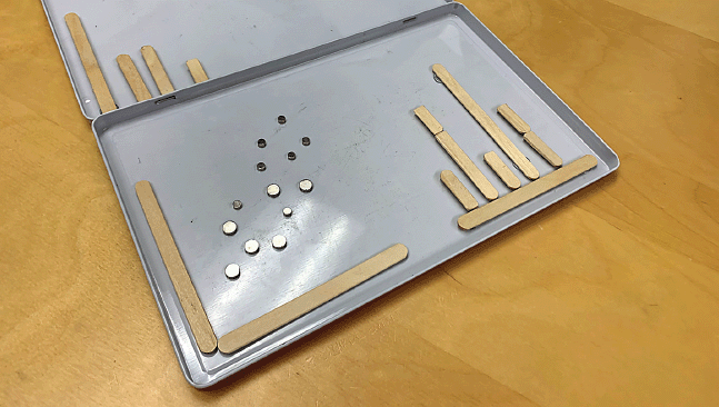 | Figure 1. Metal box with magnets and ice cream sticks used to provide tangible representations of data visualizations in a University of Maryland undergraduate data visualization class. |
From Visual to Spatial
So, how does one go about extricating the "visual" from visualization? The key lies in the idea expressed above: transforming visual representations into spatial representations. In the class example, this role was filled by the magnet board, which replaced a visual representation with a physical one. The general approach is known as sensory substitution in accessibility research, and enables, for example, a blind person to use touch to "feel" a chart, or a deaf person to read subtitles on a screen in lieu of hearing the words spoken.
When it comes to sensory substitution to accommodate blind people using visualization, the two practical options are to use touch or sound [3]. As it happens, we have also experimented with the use of scent for this purpose [5], but this is not a general and widely available solution. In our interview study involving 10 O&M experts, all of whom are blind, we derived many useful guidelines for how to best substitute vision while leveraging the knowledge blind individuals have about the world, including the haptic feedback from their white cane, natural and artificial sounds in their environment, and the use of verbal versus nonspeech audio for different kinds of data (Figure 2).
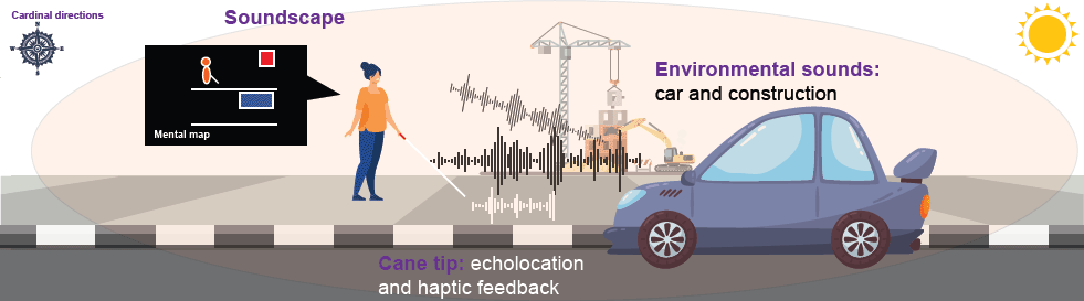 | Figure 2. Sensory environment that blind individuals face in today's world, including both haptic and auditory sources. |
Perhaps the most important outcome from our study is the one outlined above: that visualization is a useful intermediate representation even for a blind person. This finding answers a question that has been plaguing accessible data researchers for a long time: Should we be creating auditory or haptic representations of data visualizations, or should we be directly creating novel representations of the data itself using the chosen substitution medium? The answer seems to be the former. Rather than reinventing a new haptic or audio language from scratch, visualization can serve as a unified reference representation. The reason is that there is clear value in harnessing blind people's existing knowledge of visualization, which many have either from earlier in life, before they were blind, or from prior professional experience or education.
Furthermore, using visualization as a unified representation also facilitates blind individuals collaborating with sighted coworkers. Again, the takeaway here is to think of visualization as more of a spatial representation than a visual one.
Quo Vadis, Visualization?
The past few years has seen significant activity in the visualization community to make amends for 30 years of poor accessibility. Reviewing the current and future state of the art is beyond the scope of this article, but I will outline the main efforts that are starting or already underway:
- Not just visuals. Blind users were the first group of people with disabilities that the visualization community focused on—perhaps because of the disconnect between the fundamentally visual themes of the field and a population that cannot see—but there are other forms of disability that should be considered in visualization settings. The Chartability framework [6], which helps evaluate the accessibility of visualizations, systems, and interfaces, targets a broad set of accessibility aspects beyond blindness, including cognitive, motor, neurological, and vestibular accessibility.
- Sound beyond speech. Screen readers, which use speech to verbalize text on a screen, are one of the leading success stories of the mobile computing revolution, with an assistive device in virtually everyone's pocket. However, there is significant potential in improving screen-reader experiences for data visualization [7]. Furthermore, sonification, the use of nonspeech audio to convey data, has yet to gain widespread adoption among blind users, despite having existed as a scientific field for close to 30 years and despite being so well suited for the task. More work is needed here.
- Touch strikes back. Haptic interfaces are costly and highly specialized, thus limiting their practicality. As a case in point, even a single-line refreshable Braille display may cost thousands of dollars to purchase. However, haptics technology is becoming cheaper—for example, the American Printing House for the Blind and HumanWare have recently partnered to build the Dynamic Tactile Device (DTD), a tablet-size device that combines multiline Braille and tactile graphics for creating touch-enabled diagrams.
- Nihil de nobis, sine nobis ("Nothing about us without us"). The accessibility field is rife with stories of technologists parachuting in, "solving" an issue (radar sensors on white canes are almost a meme among blind individuals at this point), and then disappearing into the sunset to leave people with disabilities stranded with a new gadget that they didn't need in the first place. To avoid such outcomes, diverse teams of researchers and practitioners should engage in inclusive codesign relationships with the intended audience to ensure that they are solving the correct problem and in the correct way [8].
- Don't shop, adopt. As a corollary to the above point, many people with disabilities do not have the financial resources to purchase expensive new equipment for specialized tasks such as data analysis. Today's smartphone-based screen readers are so successful precisely because most people already require a smartphone in their daily personal and professional lives. This means that any new interventions that researchers and practitioners introduce to make life easier for a blind person should ideally be accessible using assistive and general technology that people already have at hand.
We're at an important point in time in the field of data visualization, where an ancient wrong could be righted. We can only work toward making these accessibility efforts a core part of the research field so that they can lead to more just, equitable, and universally accessible data representations in the future.
References
1. World Health Organization. Blindness and Visual Impairment; https://www.who.int/news-room/fact-sheets/detail/blindness-and-visual-impairment
2. Note that while we prefer people-first language—i.e., people with disabilities—we follow convention in blind communities where the term blind person is common, and often even preferred.
3. Chundury, P., Patnaik, B., Reyazuddin, Y., Tang, C.W., Lazar, J., and Elmqvist, N. Towards understanding sensory substitution for accessible visualization: An interview study. IEEE Trans. on Visualization and Computer Graphics 28, 1 (2022), 1084–1094.
4. Choi, J., Jung, S., Park, D.G., Choo, J., and Elmqvist, N. Visualizing for the non-visual: Enabling the visually impaired to use visualization. Computer Graphics Forum 38, 3 (2019), 249–260.
5. Patnaik, B., Batch, A., and Elmqvist, N. Information olfactation: Harnessing scent to convey data. IEEE Trans. on Visualization & Computer Graphics 25, 1 (2019), 726–736.
6. Elavsky, F., Bennett, C., and Moritz, D. How accessible is my visualization? Evaluating visualization accessibility with Chartability. Computer Graphics Forum 41, 3 (2022), 57–70.
7. Zong, J., Lee, C., Lundgard, A., Jang, J., Hajas, D., and Satyanarayan, A. Rich screen reader experiences for accessible data visualization. Computer Graphics Forum 41, 3 (2022), 15–27.
8. Lundgard, A., Lee, C., and Satyanarayan, A. Sociotechnical considerations for accessible visualization design. Proc. of the IEEE Visualization Conference. IEEE, 2019, 16–20.
Author
Niklas Elmqvist is a professor of information studies and computer science at the University of Maryland, College Park. His work spans both the data visualization and human-computer interaction fields. [email protected]
Copyright held by author. Publication rights licensed to ACM.
The Digital Library is published by the Association for Computing Machinery. Copyright © 2023 ACM, Inc.


Post Comment
No Comments Found