


Authors:
Philip Kortum

In the early 1960s, Douglas Engelbart [1] first introduced the notion of "knowledge in the world" versus "knowledge in the head" for computer interfaces—an idea that was later formalized and popularized by Donald Norman in his seminal book The Psychology of Everyday Things. From an interface design standpoint, knowledge in the world simply means that the controls you need are visible, and the identification and operation of these controls can be done through recognition rather than recall. Drop-down computer menus on modern graphical user interfaces, as shown in Figure 1, are a good example. Users don't have to memorize the command or even its specific location. Rather, they can browse through the menu command structure until they find the control they want to use.
 | Figure 1. Drop-down menus provide the user with knowledge in the world. It is clear what the user can do in this command window. |
By contrast, knowledge in the head means that the user must memorize the necessary commands and controls for the operation of a specific device. In a bygone era many, if not most, computing tasks required significant knowledge in the head. You had to know the syntax or the command language to perform even rudimentary tasks. For example, determining what files were on your computer required you to have specific knowledge in the head to perform that task. If you were using a DOS-based system, you had to know the command was DIR, and that if you switched systems, the command was likely different. These kinds of systems were the ultimate hidden controls, as you needed to have complete knowledge in the head to accomplish anything (Figure 2).
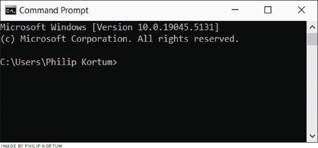 | Figure 2. A DOS command window. Without specific knowledge in the head, the user cannot perform a single action. |
Insights
→ As interface complexity has increased, more controls are being hidden from the user.
→ While these hidden controls make the interface look easier to use, they actually make the interfaces much harder to use for novice users.
→ Designers need to make all controls visible in ways that maximize the user experience.
Human-computer interaction specialists quickly realized that requiring too much knowledge in the head prevented access to systems by a broad range of nonspecialist users. The birth of the drop-down menu system took us away from these hidden controls and put the knowledge into the world, allowing any user to identify which actions were available and then use the specific action they wanted. Much has been written about how this fundamental change altered and helped accelerate the adoption of computers [2]. With drop-down menus, people without specific, detailed training, and knowledge could access and use computers effectively and efficiently for a variety of new tasks that became attainable because of the new interface paradigm.
The birth of the drop-down menu system took us away from hidden controls and put the knowledge into the world.
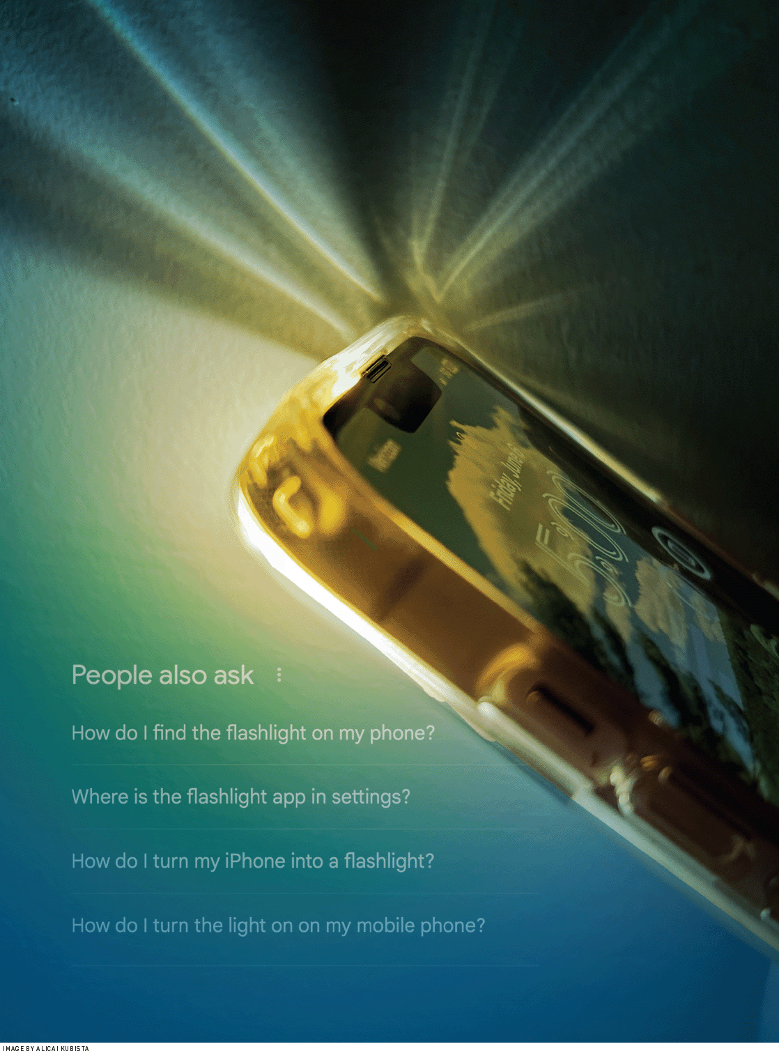
Fast-forward 40 years and we are frequently reverting to a state where significant knowledge in the head is required to perform even rudimentary tasks on a computerized device. Of course, the form of the computer that we are using has changed drastically. Most desktop computers still adhere to the visible control model that was developed in the 1980s. Most of us, however, carry in our pocket a powerful handheld computer that is deceptively described as a phone, and this new computer demands that we have specific knowledge in the head. For example, if I want to activate the flashlight on my iPhone, I have to know to swipe up from the bottom left-hand corner in order to bring up a control panel where the flashlight button exists. There is absolutely nothing on the interface that indicates this is an available action. That might be fine if the action were intuitive or if it had some prominent affordance, but short of having read the iOS operation manual that is included in the box with the iPhone (oh, wait, no user manual is included in the box), there is no way to know this control exists. It is the quintessential hidden control—useful, lurking, and available—but only to those who know the trick. Want to see notifications on the iPhone? That's a separate hidden control, swiping down from the top corner this time. Apple Pay? Press an unlabeled, multifunction button twice. The number of hidden controls makes even simple operations difficult.
It's not just our phones that require this additional knowledge in the head. The other day I was locked out of my car. I had my keys, but the key fob button wouldn't work and neither would the little button on the door handle that normally unlocks the car. At this point, every action I had to take in order to get into the car required knowledge of a hidden control. Why didn't I just use my key to get in? First, you need to know there is a hidden key inside the fob. Second, because there doesn't appear to be a keyhole on the car door, you also have to know that you need to disassemble a portion of the car door handle to expose the keyhole. After turning to the Internet to help me diagnose the problem, I was able to determine that my car had somehow gotten itself into its no remote unlock mode. The leading clue was that my car's blinkers flashed a specific pattern whenever I tried to unlock the car, and I was able to use that information to find the fix. For nearly 30 minutes I was locked out of my car because a) I didn't understand the hidden codes about the problem (and how it had gotten into that state) that the car was trying to communicate with its flashing lights and b) all the available solutions were also hidden. That included the mechanical solution of opening the car door with a physical key and the computer solution of reprogramming the system to the correct mode. The fix was a series of arcane button presses on my key fob that put the car back into the correct mode so I could unlock it.
Graphical user interfaces inside automobiles have also fallen victim to this "knowledge in the head" paradigm. Witness the navigation system in Apple Maps in CarPlay. The system developers obviously wanted to display as much map as possible, as shown in Figure 3 a). This makes sense, but to do that they relied on the use of hidden controls. If I want to enter a destination or zoom in on the map, I have to know to touch the bottom left-hand portion of the map, which then brings up a set of control icons that allow me to enter a destination or zoom in and out, as illustrated in Figure 3 b).
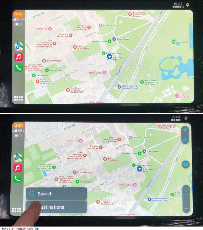 | Figure 3. a) Apple Maps displayed with CarPlay, lacking menu items; b) the hidden control to bring up search and zoom functions when you touch the screen. |
Another common form of hidden control are features that are temporal in nature. The classic example of this is the standard computer on-off switch. Even if the button is clearly labeled, simply pressing it does not create the desired action. Instead, you must press and hold it for a specific amount of time to get the desired action. Without training or prior knowledge, the control operation is hidden. The electronic locks at my house, seen in Figure 4, have done one better than that; they have combined a hidden control with a temporal control. If you want to unlock the door, there is a large button on the lock that, although unlabeled, seems to have a significant affordance that says, "Put your thumb or finger here." However, if you want to lock the door, then the hidden control problem becomes evident. Again, the giant center button seems to be telling me I should operate the system to lock the door using that control. But to lock the door, I must know that the hidden control to lock is the pound key. To make matters worse, it's not a simple press of the pound key. It's a press of the pound key for a full five seconds in order to activate the lock sequence. The combination of the long temporal window and the hidden control makes locking the door nearly impossible, unless you are well acquainted with the system and its operation.
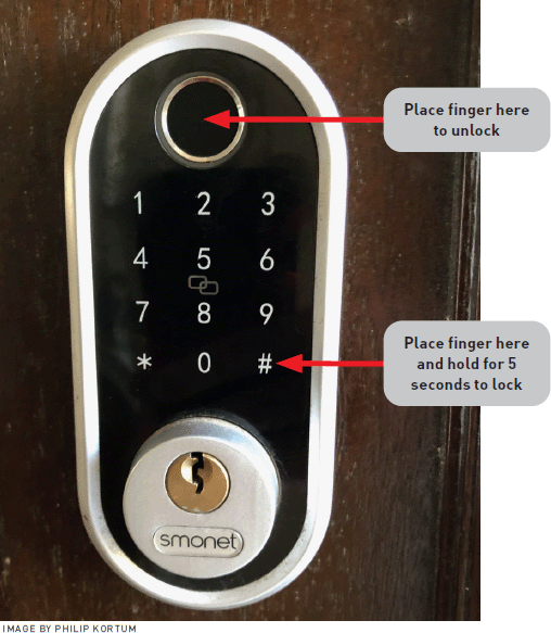 | Figure 4. The hidden controls on an electric door lock. Unlock is supported by a good affordance, but lock is not. |
Have you ever used the volume knob on your stereo to turn it all the way down, only to have the stereo decide that the really great ZZ Top song that just came on simply has to be played and the volume is turned back up? Of course not! This would be, in aircraft vernacular, an uncommanded movement. When I set the volume to zero, I have the full expectation that it will stay at zero until I tell it otherwise. Now try that same task on your iPhone. Turn the volume all the way down (or flip the volume switch to the silent position) and then wait to see how many uncontrolled sounds emanate from your phone, even when you have turned the volume off. You'll be surprised at how many apps have access to a set of hidden controls that allow them to override your seemingly simple and straightforward command of silence. Examples include your Internet-enabled litter box that needs to tell you it just cleaned itself at midnight or Instagram deciding it must inform you that your daughter posted a video at 3:30 a.m.
While this phenomenon of hidden controls and commands might seem to affect only amateur users, highly trained users can also be affected by these hidden interfaces. I recently wrote about the decline in the usability of statistical analysis software [3]. Many specialized research personnel are being compelled to move away from menu-driven systems (e.g., SPSS) and back toward line editing programs, such as R. In its base form, R is just like the DOS window, and the tyranny of the blank screen looms large over the interface. Users are required to have significant knowledge in the head beyond statistical knowledge to perform even the simplest of tasks.
It's time that interface designers reevaluate their use of hidden controls and work hard to create more usable systems where the functions of the device can be accessed completely and fully using only knowledge in the world.
Over 35 years ago, Donald Norman [4] said that visibility (later renamed discoverability) was one of the fundamental design principles—users should be able to determine what a system can do through a systematic exploration of the controls and menus. Since we have known about this for so long, why have hidden controls proliferated in the past decade? One major source of hidden control proliferation may lie in the sheer number of features that are being packed into modern devices. As we add more and more features that need to be controlled, we simply run out of screen space to accommodate all the visible controls that would be required. Moreover, the complexity of our systems and their unknown or misunderstood interdependencies can also lead to what appears to be a hidden control. In certain modes the control is hidden, while in others it is not. If the user does not understand these interdependencies, then they appear as a hidden control. Much of the blame lies with the interface designers themselves. It takes a lot of work to understand how to create systems that have visible controls for all states. It's much easier to overcode an existing control, such as the door lock, or simply create a hidden command, such as tapping an unidentified location on the screen, than it is to figure out how to create a visible and persistent control button. Even the ubiquitous computer shutoff button could be better. The designers might tell you the way these buttons are designed is to prevents accidental shutdown, which is a worthy goal. But the honest explanation is that designers want to create a specific aesthetic without concern for the user. A simple, well-labeled rotary control, shown in Figure 5, would accomplish the same function and prevent the user from accidentally activating the control in a way that is no longer hidden.
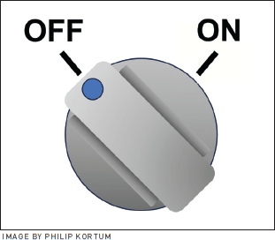 | Figure 5. Replacing the ubiquitous computer power button with a visible control, such as the one shown here, would retain functionality and ease of use. |
There are countless examples of thoughtful designers creating interfaces without hidden controls. The alternate approach that General Motors' engineers took when designing their map interface is on display in Figure 6. The engineers figured out how to make the necessary controls visible and persistent on the main navigation screen, in contrast to the Apple Maps interface. They did so without inhibiting the functionality and usability of the map. The result is a smoother and easier user experience, especially for the novice. No knowledge in the head is required, because all the knowledge is available in the world. Even this interface, however, has had better versions. The Buick LaCrosse's map zoom—in what I thought was one of the most usable features in a car navigation system—was accomplished with a physical knob, which allows zooming in (clockwise) and zooming out (counterclockwise) with a simple twist of the dial.
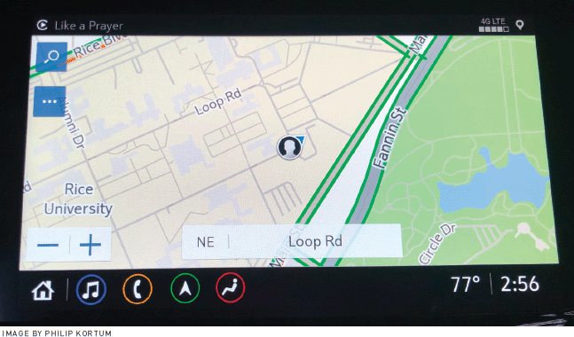 | Figure 6. Navigation in a late GM model, with visible and persistent search and zoom controls. |
It is interesting to note that most mission-critical systems don't have hidden controls. Rather, they rely on controls that are visible, persistent, and show system state. This isn't by accident. The designers of these systems recognize that the functions of these systems must be visible and operated quickly, without the need to remember how to perform or access a specific action, even though the operators of such systems are highly trained.
Contrary to the assertions of my young daughter, this critique of hidden controls isn't an "okay, boomer" complaint. Search for "best hidden controls on the iPhone" and you will get hundreds of links and videos excitedly extolling the secret ways to use the interface. I don't think any interface designer has ever said that they want to create an interface no one can find or use. Our job is to make interfaces that are easily usable by everyone, not just those who stumble across a feature, read about it on the Internet, or find out about it through the friend of a friend of a friend. If the user can't find the control, it doesn't exist to that user, and that's antithetical to what every designer should be trying to achieve.
In 1991, Mark Weiser described "disappearing computing," where computing would eventually fade into the background, performing tasks while having few to no interactions with humans. A few years later, in his book The Invisible Computer, Donald Norman [5] said that technology should be "invisible and hidden from sight." Much of what these visionaries predicted has actually come true. In the good old days, you had to constantly tinker with your car's engine controls to account for the weather conditions, the altitude at which you were driving, and other environmental factors. Nowadays, there is a hidden computer that is constantly measuring all these environmental variables and instantaneously adjusting the parameters of your engine for optimal performance. It never asks if you want to make these adjustments and does not present you with a screen of options to decide which parameters should be optimized. Rather, just as predicted, the computer has receded completely into the background, silently doing its job to provide the results that we, the users, would clearly expect.
That said, having designers intentionally hide controls from the user in the ways described in this article is certainly not what Norman and Weiser [6] had envisioned. Their belief was that a control would appear when needed or, if the function can be done automatically, not appear at all. In the case of the engine computer, intent is easy to divine (e.g., wanting a car to run perfectly). In the case of complex, multifunction computers, intent is substantially more difficult to determine. Consider the phone flashlight example I described earlier. Couldn't the phone figure out when I want the flashlight and just turn it on when I needed it? Probably not, since it would be almost impossible to figure out every situation where I might want or need the flashlight. In this case, the control must be visible or have some strong affordance that intuitively guides me to the proper control. In the case of the flashlight, perhaps it should come on if I touch it.
It's time that interface designers in the commercial world reevaluate their use of hidden controls and work hard to create more usable systems where the functions of the device can be accessed completely and fully using only knowledge in the world. Control discoverability is still an important interface design principle, and the increasing prevalence of hidden controls on new interfaces is, paradoxically, a regression to a time when computers were harder to use because their functions were not visible.
References
1. Engelbart D.C. Augmenting human intellect: A conceptual framework. SRI Summary Report AFOSR-3223, 1962.
2. Guterl, F. Design case history: Apple's Macintosh: A small team of little-known designers, challenged to produce a low-cost, exceptionally easy-to-use personal computer, turns out a technical milestone. IEEE Spectrum 21, 12 (1984), 34–43.
3. Kortum, P. Where's my jetpack? Waiting for the revolution in statistical analysis software interfaces, but going in the wrong direction. Interactions 29, 5 (2022), 68–71.
4. Norman, D.A. The Psychology of Everyday Things. Basic Books, 1988.
5. Norman, D.A. The Invisible Computer: Why Good Products Can Fail, the Personal Computer Is So Complex, and Information Appliances Are the Solution. MIT Press, 1998.
6. Weiser, M. The computer for the 21st century. Scientific American 265, 3 (1991), 94–104.
Author
Philip Kortum is a professor in the Department of Psychological Sciences at Rice University. His research is focused on the development and refinement of measures of usability and trust and on creating highly usable systems in the global health, mobile, and voting system domains. [email protected]
 This work is licensed under Creative Commons Attribution International 4.0.
The Digital Library is published by the Association for Computing Machinery. Copyright © 2025 ACM, Inc.


Post Comment
No Comments Found