Authors:
Mark Baskinger
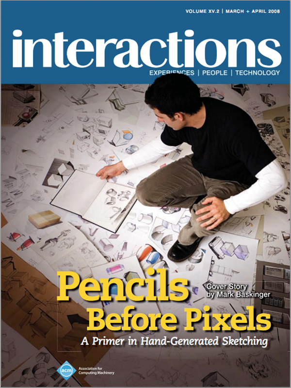
Drawings and sketches can be powerful and persuasive representations of ideas, events, sequences, systems, and objects. As part of a larger collaborative design process, hand drawing can serve as a key method for thinking, reasoning, and exploring opportunities, yet it inherently differs from wire frames and conceptual models. Innately, interaction designers employ a variety of methods for representing ideas and information, both internally in a cognitive sense, and externally in the devices we employ to record, share, and reflect. However, competency in sketching and drawing by hand seems to be diminishing across design disciplines, making it a more highly desired skill in contemporary design practice. In addition, there seems to be an apparent phenomenon of fear when it comes to drawing ideas. For many practicing designers, they have convinced themselves that they can't draw and thus position themselves on the periphery of concept generation. The fact is that we all can draw, and there is a misperception that one has to be the Michelangelo of design drawing to be able to communicate visually. As young children, we had no fear of drawing and putting our work out in the public domain, but as adults, we've grown extremely self-conscious of our abilities and inabilities and now fear being judged. Gaining competence in drawing is similar to becoming a marathon runner; it can't happen overnight. But, like running, most of us can already somewhat do itwe just need to devote the time and energy toward building this skill to become truly versed in it. As a drawing instructor in the School of Design at Carnegie Mellon University, my role is to shape students to become better visual communicators and therefore, better visual thinkers. We always start our creative processes with hand drawing: pencils before pixels. This article will touch upon some of the methods used in the School of Design to present a primer for practicing interaction designers to become better visual thinkers and communicators by employing hand-generated techniques to enrich their creative design processes.
 Envisioning, Recording, Sharing, and Reflecting
As designers, we enjoy the journey of discovery, in making relationships between intangible ideas/data and the formal elements that make an idea accessible. Initiating the creative process with hand-generated sketches to think through abstract or intangible ideas in various permutations can provide a stronger basis to refine these ideas with digital images, words, pixels, and vectors. By starting with hand-generated "analog" media like pencils and pens, we can express ideas in lower fidelity very quickly. The expediency of this process tends to yield visualizations that communicate best to the author/designer but often fail in communicating to others. To better understand the role that drawing can play in the design process, it's best to have fairly simple expectations and goals for hand-drawn activities. Explicit goals for drawing and sketching are 1. to externalize and convey the process of thinkingto transform intangible ideas to tangible information for others; 2. to reveal ideas/relationships, not results; and 3. to engage discussion around the subject/problem as an inclusive activity. The common link to all of design drawing is in constructing a graphic representation in a coherent format, one that speaks to alternative ideas and the evolution of an idea. The images that result from this process serve as vehicles to bring others into the designer's mind to better facilitate conversation and collaboration.
Envisioning ideas and transferring the ideas in your head onto paper can be challenging. The style of drawing, the methods of collecting ideas, and the media used can all vary greatlythumbnails, Post-its, napkin sketches, and doodles are valid when trying to capture an idea. There is only one rule when drawing to capture ideas: Each idea must be explored from many different perspectives. Too often people try to capture an idea with one solitary sketch that edits the amount of information. Drawing ideas in variations, details, and from multiple viewpoints can enhance communication and enable the author to think more critically about the completeness of an idea as well as to provide reference points to more effectively express each thought.
One of the most powerful uses of sketching is to record ideas for yourself through observation and note taking. The activity of drawing can occur almost anywhere but can be most effective in particular settings. Most designers actively keep sketchbooks or journals to record ideas and thoughts that can be brought back to the studio to build upon. These sketchbooks serve a variety of functions, but most important, they serve as a personal repository of ideas to communicate back to the designer. Collecting ideas in a sketchbook can incorporate digital photography combined with hand drawing and note taking to record ideas and observations. The key with most sketching and drawing is to do it directly in the context in which design implementation would occur. In these settings, your ideas can be inspired by the activities, events, objects, people, and spaces that may have direct implication on the designed artifact or system.
Drawings should not be cherished, nor should they be easily discarded. The reality is that a drawing marks a particular idea in time and represents the viewpoint of the author. Sharing and presenting ideas through drawing in a more formal setting can be very effective, especially if the drawings are seen as negotiable ideas that invite others into the conversation to ask questions and share their ideas as well. Too often are drawings viewed as final artifacts, where in the mind of the author they should be protected (in a frame, perhaps). This tendency can stifle a creative process by bringing finality or concreteness to the presentation of the idea.
Reflecting on your work is key for many reasons. This implies getting some distance and time between you and the work so that you can look at it with a renewed perspective. Regular pinups and sketchbook reviews can be very enlightening. First, regularly going back through your work may reveal competencies or weaknesses in your approach to design drawing. Second, you may notice patterns or commonalities in your work that may indicate an emerging style or vernacular. Since drawing is like handwriting, you can identify the author by his or her sketches. Having a celebrated style in a particular media is not as important as developing a consistent approach to drawing. Competency in drawing your ideas generally reveals consistency in drawing forms, structuring ideas, and effectiveness in communication.
 Drawing What You Really Mean: Constructing Stories Through Narrative Sketching
Using visual methods to communicate ideas entails creating a substructure of nonverbal communication. Too often designers make hasty, unrefined drawings that must be laboriously over-explained to colleagues and clients. The very premise of design drawing is to convey thinking, to tell a story to someone else. Therefore, as a visual "story," a sketch must sequentially reveal information across the page in an orderly and scripted fashion. A narrative substructure built into the organization, hierarchy, and composition of the piece will enable the nonverbal story to unfold. Narratives, which provide accounts for telling the story of events, experiences, and ideas, offer concrete touch points for viewers with a sequential format divided into three distinct partsbeginning (to invite the viewer in), middle (to engage the viewer), and end (to provide closure). The viewer should immediately recognize a starting point, a main body of information, and an ending point to provide a comprehensive visual discourse of the concept. Regardless of the particular emphasis, drawn images somehow yield faster access to an idea than words. This, of course, is assuming that the sketch or drawing is clearly organized and communicates well. Visual narratives can take many formsfrom a page of loose sketches around a common theme to a highly structured and organized matrix. For interaction designers, visual narratives also include aspects of storyboarding and diagramming.
Within each narrative sketch, there may also be elements given importance through increased size, enhanced color, or fidelity. In storyboards that read sequentially from beginning to end, there is clear termination. However, in loosely structured narrative sketches, the conclusion or ending point is determined by the layout with a clear demonstration that one element on the page is in fact the key concept. A sequential progression of sketches across the image plane or page space will provide cues for orientation as well as indicate some form of conclusion. By structuring parameters for the viewing experience through composition and hierarchy of drawn elements, the body of the work can manifest in a various ways. Again, the ultimate goal is to communicate ideas and thinking to others, so the author must know to whom they are communicating in terms of knowledge of the subject, familiarity with design processes, and visual/aesthetic sensitivity. Understanding both the character of the audience and the format for presentation will keep the narrative focused and succinct.
 Anatomy of a Compelling Narrative Sketch
Narrative sketches differ from ordinary sketches in the sense that they are structured to actively engage the page space to present ideas in a sequential way. Leveraging the way the Western world reads, most visual narratives move from left to right and top to bottom within the page space. They tend to start with the seed of an idea in the upper left and flow diagonally through to the bottom right, clarifying the idea into a refined summary drawing most prominently displayed. Visual narratives can be loosely structured as a composite of drawings occupying the same page or a highly structured matrix. When depicting sequential interaction, a storyboard structure can be particularly useful in communicating key events. Again, storyboards move from left to right and top to bottom but present ideas contained within each bounding cell.
It is essential in all sketching that the images you want the viewer to pay attention to are positioned on the page in a visually accessible way, not obscured by doodles and notation. When teaching sketching and design drawing to young design students, I always emphasize simplicity as a rule. The more simply you can communicate an idea, the better chance you have at effectively reaching the viewer. Sometimes it can be difficult to define what a simple sketch actually is. As a standalone image it may not be possible, but in context of other drawings that communicate the concept, confusing or distracting elements can be identified and subsequently removed. Knowing what you want to communicate and being able to edit out the unimportant, redundant, or confusing information is key.
Calling out key information and ideas in the context of a larger drawing can be done in a number of ways. One method is to use scale to establish a hierarchy in communication to differentiate dominant or essential images from subordinate or supportive ones. Another approach is to increase fidelity or resolution of key ideas by using tighter technical control of line, tone, and color. While establishing a hierarchy is necessary to enhance readability and communication, combining too many levels of differentiation (enhanced line work, excessive color, etc.) may yield an overworked or overly complex sketch.
 A Quick and Employable Strategy: Moving from Words to Pictures, or from Written Narratives to Visual Narratives
Interaction designers practicing in service design and design for user experience come from a variety of backgrounds and educational training. In conducting design drawing and sketching workshops in a variety of conference and business contexts, I've learned that many interaction designers express their ideas only through written narratives, wire frames (for screen development), and very simplistic doodles. Sketching and visualization are often separated as the work for visual designers or industrial designers, who now find themselves in the world of interaction design because they tend to possess a better skill set for communicating concepts in visual form. Many of the interaction designers I've met express frustration for this apparent divide and believe that if they had these visualization skills, they would better serve their teams. Conference workshops are too brief of an experience to truly acquire drawing skills, and design drawing books generally address only good visual aestheticsshowing eye candynot the rationale for structuring drawing to organize and express ideas.
To better equip interaction designers who desire the ability to become better communicators, I've developed a series of worksheets (see page 36) that can ease the transition from using words to using pictures and help keep sketching on target. Incidentally, the best communication is often a combination of words and images. One of the main issues I've noticed from working with professional designers and design students is that knowing what to draw is really the most difficult part.
To shift verbal and written communication toward a compelling sketch or visual narrative, a coherent plan may help to focus drawing efforts and resolve the dilemma of not knowing exactly what to draw. As interaction designers we are adept at guiding interaction and shaping user experience through designed systems or artifacts and often focus on small events to identify design opportunities. The sample worksheets shown here represent a basic approach to structuring drawings to communicate design research or design intent by simplifying interactions into key points, events and scenarios. Rather than structuring an elaborate storyboard all at once, designers can first list out the critical events for design attention. Next, key components, actions, objects, people, and systems that shape the interaction of each event can be listed to provide a greater sense of context. For example, when looking at how an elder interacts with her dishwasher, or more specifically, how she cleans dishes using a dishwasher, one key event to design for is the pre-rinsing of dishes in the sink and transfer/loading into the appliance. This event comprises the following elements and activities: dishes, soap, sink, dishwasher door, cups, flatware, standing, reaching over, bending, and stooping, among others. Once this list is established, a summary statement can be crafted to inform the drawn component. This statement can then be used as support within the drawn image. An example for this scenario would be: "An elderly woman stands at the sink rinsing off dishes and sequentially places them into the dishwasher by bending and stooping to reach the lower rack. She holds on to the wet porcelain sink for balance because her walker does not fit in the access space when the dishwasher door is fully open." Now that this statement is clarified, a series of thumbnail images can be generated to illustrate the event of pre-rinsing and loading. Thumbnails are smaller, less refined drawings that can be created quickly and easily. Their expediency can enable designers to take multiple viewpoints to best illustrate the relationships of the person-product-system.
The first worksheet (or series of worksheets) is intended to capture the key events during interaction from many different perspectives using words and images. The second worksheet enables designers to pick the best viewpoint from the thumbnails to illustrate the key events at a larger size incorporating more detail. In the dishwasher example, there are four key events illustrated to demonstrate major physical interaction. Finally, the second worksheet can be adapted for concept development where key events are used to inform design opportunities and concepts. Since the format of these sheets can vary, I encourage designers who are interested in this method to develop their own framework to use sketching combined with written narratives to express their ideas.
An alternative method for using these worksheets is to represent interaction and systems design from many different perspectives. For example, the design of a restaurant experience may require the designer to consider the perspectives of the patrons, the workers, or the products (food) to find opportunities for innovation. In this sense, using worksheets can enable enough individual sketches to construct a matrix or storyboard to communicate these perspectives.
Design drawing and sketching are an integral component to the development process for many designers. Sketching by hand tends to be very engaging and invites others in for collaboration. It is important to remember that drawing by hand can enable you to think differently about a subject or a design problem and can equip you with greater persuasion and impact during collaboration. Hand-generated drawings can also provide a basis for transitioning into digital sketching in a variety of tools. The expediency and impromptu nature of picking up a pencil and letting ideas flow onto paper can be both powerful and compelling. Developing sketching skills and your own methods to help you to draw more effectively with greater intent is the key. We might not all become white-board heroes, but drawing ideas with confidence and clear intent can serve to clarify, lead, and facilitate collaboration in meaningful ways.
Mark Baskinger
Carnegie Mellon University
[email protected]
About the Author
Mark Baskinger is an assistant professor in the School of Design at Carnegie Mellon University and the co-founder of The Letter Thirteen Design Agency. His work spans across graphic, product, interaction, and environmental design. Mark's research at CMU focuses on how artifacts communicate through their behavior, form language, and context to inform interaction and shape user experience. His work has been featured in design publications and has been exhibited in numerous galleries and museums, including the Museum of Modern Art (New York), I-Space Gallery (Chicago), the Krannert Museum (Champaign, IL), and the Regina Gouger Miller Gallery (Carnegie Mellon University). For a sample of Mark Baskinger's current work, please see: www.letterthirteen.com and www.design.cmu.edu
DOI: http://doi.acm.org/10.1145/1340961.1340969
©2008 ACM 1072-5220/08/0300 $5.00
Permission to make digital or hard copies of all or part of this work for personal or classroom use is granted without fee provided that copies are not made or distributed for profit or commercial advantage and that copies bear this notice and the full citation on the first page. To copy otherwise, to republish, to post on servers or to redistribute to lists, requires prior specific permission and/or a fee.
The Digital Library is published by the Association for Computing Machinery. Copyright © 2008 ACM, Inc.


 Figure.
 Figure.
 Figure.
 Figure.
 Figure.
 Figure.
 Figure.
 Figure.
 Figure.
 Figure.
 Figure.


Post Comment
No Comments Found