Authors:
Jon Kolko
In a creative context, creative engagement—both external, in a consultancy, and internal, where a client is a stakeholder—comes in two forms: low-touch and high-touch. Low-touch creativity is characterized by designers making things and then showing what they made; communication between the design team and the client is short and infrequent. High-touch creativity is characterized by a blended client–creative team making things together, and designers improving them; communication is constant.
High-touch creativity is harder. And it leads to happier, more trusting clients; and that trust is critical when designing at a strategic, influential level. But it's going to drive your designers crazy.
Low-touch creativity leads to a great unveiling, which inevitably leads to fire drills. In a low-touch creative engagement, deliverables are expected to speak for themselves. Designers try to identify client needs as quickly as possible, produce an artifact that solves for those needs, and present the artifact. Often, this type of project has a quantity of fixed iterations specified in a project plan or, in the case of a consultancy, a legal contract. For example, a design team may commit to three cycles of creative activities, each with an opportunity for their client to provide their opinion and criticism.
The limit on feedback cycles is perceived as a form of protection for the designer. Each iteration brings new ideas to life, and that sparks new opportunities for further investigation. Since design is so subjective, this form of creative effort can go on forever; providing only three opportunities for revisions forces a client to make decisions.
But this puts a big burden on the designers to "get it right." If a client isn't happy, it's a really big problem, because there's only a limited amount of time for them to become happy. Each iteration is infused with anxiety, second-guessing, fire drills, and late nights. The output is often "unveiled," and each iteration is presented as a Thing That Is Important. These reveals feel like big events (imagine Mad Men, with the team staying up all night and the polished rendering literally exhibited by lifting the opaque layer off the sketch.)
If I run a project like this, in an effort to protect myself from infinite creative spin, I'm actually setting up a dynamic to have every drop of creativity squeezed out of me and my team. It's in the client's best interest to expect more "work product" out of each iteration and to be overly demanding. It creates a false sense of urgency for the client, as if to say "If we don't get this the way I want it, quickly, we're out of time." Each cycle becomes about quantity, not quality.
Low-touch creativity inevitably creates a relationship with a client that positions a designer as a set of hands, to be directed. "Move that a little to the left, make that a little larger," and—a phrase that drives designers crazy—"add more pop." This is true in all forms of design, not just those that deal primarily with aesthetics; while viewing iterations of enterprise software flows, I've seen clients "art direct" the placement of buttons and informational displays, and even the arrangement of data fields on a form.
In a high-touch creative engagement, design becomes an almost entirely public activity.
High-touch creativity changes the way we work. In a high-touch creative engagement, design becomes an almost entirely public activity. We recently worked on a design project with a government client that was high touch. This means that:
- When we wrote use cases and scenarios, we did it in a shared Google document—and the client had edit access and was encouraged to edit, not just comment.
- When we sketched wireframes, we drew them in FigJam—and the client had edit access and was encouraged to edit, not just comment.
- When we created visual high-fidelity screens and comps, we drew them in Figma—and the client had edit access and was encouraged to edit, not just comment.
- We had daily working sessions of up to three hours, where design was occurring in the meeting, with the client.
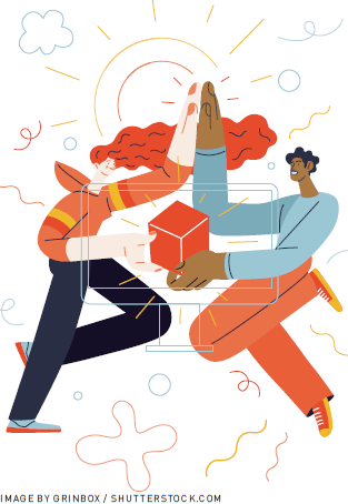
None of these are particularly unique as one-off experiences, except that with high-touch creativity, the vox populi nature of the creative work is relentless. Every meeting is a creative meeting, and in these meetings, design occurs. At any time, the client can see the work progress. There is no unveiling, no surprise. In some sense, there are no deliverables, because the work is always being delivered. And because there are no surprises, there's no need to be right, right now. The work emerges collectively, and the whole group claims ownership over it—and the whole group understands why decisions were made, because they helped make them.
Theoretically, this approach mirrors two core tenets of the software development process advocated by Kent Beck: working product is more important than documentation or process, and respond with changes rather than sticking to a preformulated plan [1]. I have found that these similarities are apparent to clients, who say things like, "Wow, this is just like Agile."
The benefit of this form of high-touch creative engagement is trust. The client and the designers are clearly on the same team. There are no creative secrets. We made it together. Stakeholders that regularly invest big money in design are looking for someone to collaborate with, and that collaboration is an ongoing, continual process. They aren't just looking for good design; they are also, and sometimes primarily, looking for someone they can trust to guide them through a messy, confusing creative process.
The problem with a high-touch creative engagement. I've noticed a significant trade-off for the success of a high-touch engagement: Most designers hate it.
There's a real creative benefit of heads-down, headphones-on, leave-me-alone time. Great design emerges from creative exploration, and it's well established that this demands focus and flow (see, for example, Mihaly Csikszentmihalyi's writing on flow [2], Donald Schön's theory of reflective practice [3], or my own writing on abductive reasoning and sensemaking [4]). Many designers lean introverted, preferring to work by themselves for large chunks of time. And even after a working session or a collaborative brainstorm, designers have historically needed to go away, marinate, unwind, and then make things.
Additionally, many designers—particularly those new to the profession—don't feel comfortable showing incomplete work, because they think it's not very good (and they're probably right, if good means bulletproof). There's a feeling that, without more polish or finish, a nondesign audience won't be able to see the work for its thinking and instead will get lost in its incompleteness. And they are right! Without the proper contextualization, those without design training do have difficulty seeing between the lines of incompleteness, and do get lost in what isn't there, failing to see what is.
Designers have always had a rebellious "us vs. them" approach to the rest of the world; witness the lore around Paul Rand, that when he unveiled the NeXT logo to Steve Jobs, it was a "take it or leave it." Jobs explains that "I asked him if he would come up with a few options, and he said, 'No, I will solve your problem for you and you will pay me. You don't have to use the solution. If you want options, go talk to other people'" [5]. This is a bit over the top, but the sentiment stands for many designers, and in fact this form of creative clash and rejection of corporate civility actually can lead to creative breakthroughs and discovery: It's literally disruption, a Silicon Valley buzzword that conservative companies strive to achieve.
Which approach is right? The Paul Rand take-it-or-leave-it approach may have worked at one time, although most older designers describe Rand as a unique character who, after building a reputation over decades, could get away with such an abrupt style. But for most of us, it just doesn't work that way anymore, and probably shouldn't, because it's obnoxious (and more pragmatically for a client, puts all chips on one bet.)
But the answer isn't what one of my old mentors called a group grope—long conversations and lots of creative cycles to get at what a designer, with a strong design pattern language, probably could have come up with quickly on their own.
The right approach is highly contextual, dependent not on the quality of the designer, but rather on the creative capacity of the "nondesign team." Do they understand what an unfinished design is? Can they provide concise, thoughtful feedback, and minimize how many times they change their minds? And do they realize that, although design can be artistic, it's not entirely subjective?
The answer no isn't surprising. Business culture has traditionally celebrated analytical thinking and pragmatic reasoning, and relegated more emotional disciplines—like design and the arts—to second-class citizens. And for companies and organizations where this is still the case, a high-touch creative engagement is the way to go, because it may be the only way to actually achieve any form of creative success at all.
But for companies that want to, there's room to change. I'll question, but not micromanage, my surgeon. As we realize the importance of creativity, and trust that those we've hired to do their job will do it well, we'll shift the onus back to designers to patiently educate and inform, to share the wonderful parts of the creative process when it makes sense, and to do their jobs: to humanize technology and create magic.
1. Beck, K. and Andres, C. Extreme Programming Explained: Embrace Change. Addison-Wesley, 2004
2. Csikszentmihalyi, M. Flow: The Psychology of Optimal Experience. Harper Perennial Modern Classics, 2008.
3. Schön, D. The Reflective Practitioner: How Professionals Think in Action. Basic Books, 1984.
4. Kolko, K. Exposing the Magic of Design: A Practitioner's Guide to the Methods and Theory of Synthesis. Oxford Univ. Press, 2015.
5. 1993 interview re: Paul Rand and Steve Jobs. YouTube; https://www.youtube.com/watch?v=xb8idEf-Iak
Jon Kolko is a partner at Narrative and the founder of Modernist Studio, acquired in 2021, and the Austin Center for Design. He has written several books, including Well-Designed: How to Use Empathy to Create Products People Love (Harvard Business Review Press). [email protected]
Copyright held by author
The Digital Library is published by the Association for Computing Machinery. Copyright © 2024 ACM, Inc.





Post Comment
No Comments Found