


Authors:
Zehua Zeng, Leilani Battle

As data continues to grow at unprecedented rates, we encounter unique challenges in helping analysts make sense of it. A prime example involves visualizing the data, where an analyst may have to reduce thousands of data columns and billions of data records to a single visualization. This often involves selecting which columns to visualize; sampling, filtering, or aggregating the data down to a manageable number of records; and mapping the results to intuitive visual encodings such as positional axes, bar heights, or color hues.
Every step of the way, the analyst must grapple with what to focus on and how to translate the focus into a compelling image. We see a small slice of this problem in Figure 1: We can generate many different visualizations for a movie dataset, but the default design choices can be problematic. For example, the line chart in Figure 1 is just a blob of blue pixels. How can visualization tools help analysts navigate this complex and even frustrating web of interconnected design decisions?
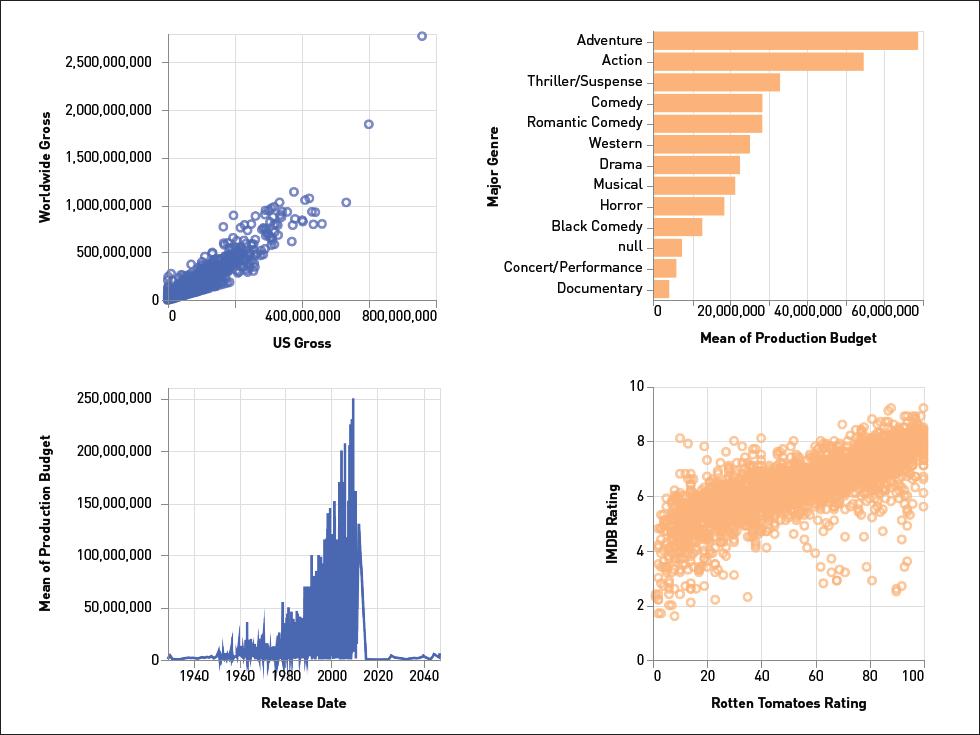 | Figure 1. Even a simple movie dataset can be visualized in many different ways (data source: [4]). |
We have seen an explosion of visualization recommendation tools responding to this challenge. These tools aim to reduce decision fatigue by automating part or even all of the visualization design process. We summarize how these tools behave based on what they aim to automate [2]: which parts of the data to focus on (recommending data columns, rows, queries, etc.), which visual encodings to apply (recommending scales, colors, shapes, etc.), or both.
Graphical perception research measures how well people perceive different encoding choices, which could inform the development of visualization recommendation tools. However, when we surveyed current tools [2], we noticed a surprising pattern: They seem to reference few if any findings from graphical perception when recommending visual encodings. This result led us to another important question: Why aren't current visualization recommendation tools incorporating experiment results and guidelines from graphical perception research?
Why aren't current tools incorporating experiment results and guidelines from graphical perception research?
A natural starting point is to review the graphical perception literature and figure out which parts are most relevant to visualization recommendation tools. This led us to review 132 interesting works in graphical perception [3], from visualization textbooks to decades-old experiments of how people perceive bar charts to studies of what happens when you add iconography or other embellishments to visualizations, among others. The sheer breadth and depth of work was at times overwhelming, and we started to see the problems that developers were running into. For example, it's a struggle to separate the papers (and textbooks) that are relevant to visualization recommendation from those that are not. After reviewing 132 papers and books, we found that less than half of them (59 out of 132) were actually directly relevant for visualization recommendation.
Even when relevant papers are found, it's not obvious how someone outside of graphical perception would translate them into actionable guidelines or code. Most of the papers we reviewed only provided recommendations for future studies that could be conducted, or high-level suggestions that have unclear applicability to visualization recommendation, such as how visual embellishments might be used in the abstract rather than how they could be generated within a specific tool [4].
Put another way: We observed a mismatch between the available outputs from the graphical perception literature (unstructured diagrams, graphics, text summaries) and the expected inputs to visualization recommendation tools (executable models, concrete encoding rules, actionable design guidelines).
Our results reveal an entirely new perspective on navigating the handoff between graphical perception and visualization recommendation: Rather than expecting developers to manually map graphical perception breakthroughs into visualization recommendation code, what if we develop a pipeline for translating results from graphical perception into data that could be imported into visualization recommendation tools? A systematic approach to addressing the problem would not only help graphical perception researchers expand the impact and reach of their work but also help tool developers avoid reimplementing what graphical perception researchers have already done. Furthermore, a pipeline could be reused in the future, so new studies in graphical perception could easily be incorporated into current and future visualization recommendation tools.
We observed a mismatch between the available outputs from the literature and the expected inputs to visualization recommendation tools.
To this end, we revisited all 59 papers from our literature review and translated each into a corresponding data file in an easy-to-use JSON (JavaScript Object Notation) format. Together, these 59 data files yielded the largest graphical perception dataset to date for use by visualization tool developers. We carefully structured the JSON files to be easy to load into almost any visualization tool. Furthermore, with a JSON format, the files could even be loaded into JSON-supporting database management systems such as MongoDB. For this reason, our dataset is easy to query and filter for graphical perception papers matching a developer's desired criteria, such as papers that include bar charts.
But what exactly is contained in one of these JSON data files? Each file specifies the exact visualization designs that were studied by the corresponding paper, such as line charts, bar charts with embellishments, parallel coordinates plots, and so on. The file also records how the designs were compared in user studies, for example, comparing bar and pie charts under certain perceptual tasks [5]. Finally, we recorded the results of these comparisons, such as whether bar charts showed a statistically significant advantage over pie charts. If user studies were not conducted—for example, if we came across a theory paper rather than an experiment paper—we recorded that as well.
Some study insights, however, were not as easily captured by our dataset. When two papers disagree, for example, how should we record it, since the corresponding data files are designed to be self-contained? Similarly, when several papers reach a consensus, where should this be recorded in our dataset?
In response, we synthesized complementary design guidelines in the form of skimmable tables (an example is provided in Figure 2). These tables summarize major recommendations proposed by graphical perception researchers. We emphasize actionable guidelines in our tables, to ensure that they provide immediate value to visualization and tool designers. In the future, we aim to detect consensus and disagreement automatically. Currently, we are investigating how Draco [6], a research-oriented visualization recommendation framework, uses constraint-based problem solvers to break ties and disagreements within our dataset.
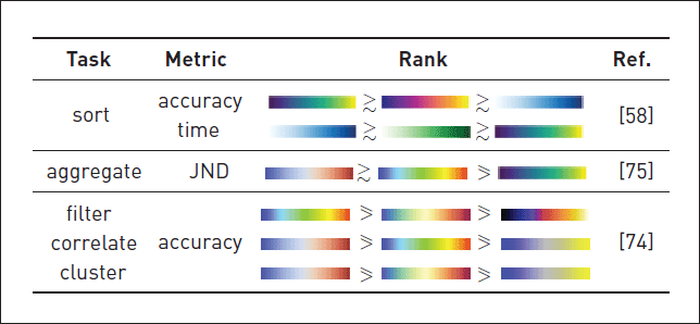 | Figure 2. An example table from our research (see Table 5 from [6]) summarizing the relative performance of different color palettes under specific perceptual tasks. |
Now that we have this data, how should people use it? We hope to see visualization designers referencing our tables when designing visualizations by hand. Our tables can help designers quickly avoid common design pitfalls in visualization, as well as select optimal encodings for certain perceptual tasks. We also hope to see researchers and tool developers importing our data into their visualization tools, thereby enabling them to automatically select perceptually effective encodings.
This work also opens the door to new ideas in graphical perception. For example, our dataset reveals an opportunity to evaluate graphical perception studies based on how they shift the behavior of visualization recommendation tools. In the future, we hope to see exciting perception-driven recommendation work building on our dataset.
References
1. Vega-Datasets repository. https://vega.github.io/vega-datasets/
2. Zeng, Z., Moh, P., Du, F., Hoffswell, J., Lee, T.Y., Malik, S., Koh, E., and Battle, L. An evaluation-focused framework for visualization recommendation algorithms. IEEE Trans. on Visualization and Computer Graphics 28, 1 (2021), 346–356.
3. Zeng, Z. and Battle, L. A Review and Collation of Graphical Perception Knowledge for Visualization Recommendation. arXiv preprint 2023; https://arxiv.org/abs/2109.01271
4. Borgo, R., Abdul-Rahman, A., Mohamed, F., Grant, P.W., Reppa, I., Floridi, L., and Chen, M. An empirical study on using visual embellishments in visualization. IEEE Trans. on Visualization and Computer Graphics 18, 12 (2012), 2759–2768.
5. Cleveland, W.S. and McGill, R. Graphical perception: Theory, experimentation, and application to the development of graphical methods. Journal of the American Statistical Association 79, 387 (1984), 531–554.
6. Moritz, D., Wang, C., Nelson, G.L., Lin, H., Smith, A.M., Howe, B., and Heer, J. Formalizing visualization design knowledge as constraints: Actionable and extensible models in Draco. IEEE Trans. on Visualization and Computer Graphics 25, 1 (2018), 438–448.
Authors
Zehua Zeng is a software research engineer at Intel. Her research interests include human-computer interaction, visual analytics, and visualization recommendation. She holds an M.S. and Ph.D. in computer science from the University of Maryland, College Park, and a B.S. in telecommunication engineering from Beijing University of Posts and Telecommunications. [email protected]
Leilani Battle is an assistant professor in the Allen School at the University of Washington. Her research focus is on developing interactive data-intensive systems that aid analysts in performing complex data exploration and analysis. She holds an M.S. and Ph.D. in computer science from MIT, and a B.S. in computer engineering from UW. [email protected]
Copyright held by authors
The Digital Library is published by the Association for Computing Machinery. Copyright © 2023 ACM, Inc.


Post Comment
No Comments Found