


Authors:
Lace Padilla

Throughout a career in HCI, most people will read dozens if not hundreds of reported statistics from user studies and experiments. The vast majority of these reports used 95 percent confidence intervals (CIs) with visually depicted error bars to express the uncertainty in the scientific findings. With years of experience interpreting 95 percent CIs, it would be natural to feel confident in one's ability to read and understand them. However, research estimates that 31.5 percent of published researchers in psychology, behavioral neuroscience, and medicine use an incorrect rule of thumb for judging significant differences between two groups with visualizations of 95 percent CIs [1].
Extrapolating these findings to the HCI community with similar statistics training, approximately one out of every three readers of this column may misinterpret visualizations of 95 percent confidence intervals. Such widespread misinterpretation is concerning, as the goal of generating visualizations of scientific results is to help readers understand the findings, not seed false interpretations.
A growing body of research in data visualization is examining ways to convey scientific findings that are less error-prone. In particular, Jessica Hullman and colleagues have systematically examined the misconceptions generated by standard uncertainty communication techniques and methods for reducing these reasoning errors.
Approximately one out of every three readers of this column may misinterpret visualizations of 95 percent confidence intervals.
For example, Hullman and colleagues [2] presented participants with a scenario where they were competitors in a fictional boulder-sliding competition. Participants were then presented with visualizations that depicted the average sliding length of an ordinary boulder or an improved boulder, which could potentially help them perform better in the competition. Participants then decided how much to pay for the improved boulder using visualizations that conveyed uncertainty in the sliding length with either 95 percent CIs or 95 percent predictive intervals. In all conditions of the study, participants overpaid for the enhanced boulder. Participants who viewed the frequentist 95 percent CIs showed the largest overpayment, and the 95 percent predictive intervals reduced overpayment. In a second study, researchers found that visualizing the data as animated random samples also improved judgments [2]. The animated visualization technique in this study was a hypothetical outcome plot (HOP) [3], which shows random draws from a distribution as frames of an animation. As an example of these different visualization techniques, Figure 1 shows a 95 percent CI and 95 percent predictive interval of randomly selected male heights in the U.S. Figure 2A shows the same information using a hypothetical outcome plot.
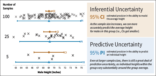 | Figure 1. Illustration of inferential and predictive uncertainty using height described in Hofman, Goldstein, and Hullman [2]. This figure shows how the 95 percent confidence intervals (CIs) shrink when more measurements are collected (5, 25, and 100) [4]. The decreasing range of the CI indicates that, with larger sample sizes, it is easier to estimate the mean height of this group. In contrast, 95 percent predictive intervals (PIs) convey how effectively we could predict a man's height given the data. Because there is substantial variability in men's height, no matter the sample size the PI does not change in size as much as the CI. |
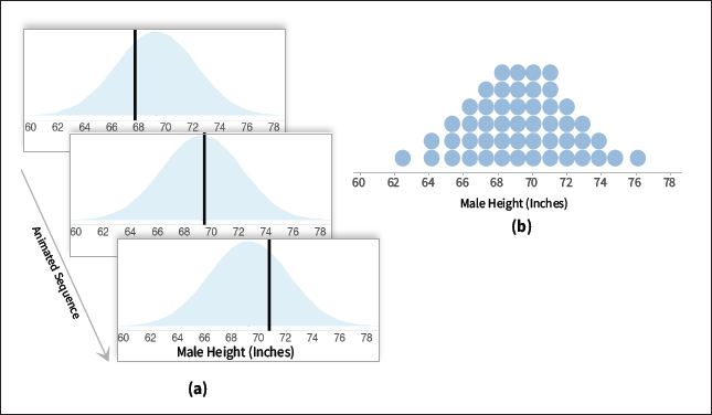 | Figure 2. A is a hypothetical outcome plot [3] of men's heights overlaid on a density plot for reference. B is a quantile dot plot [5] depicting the same information. |
To learn more about reasoning errors in uncertainty visualizations of experimental findings and how to overcome them, I interviewed Hullman, who is Ginni Rometty Associate Professor of Computer Science at Northwestern University. She is a leading uncertainty visualization expert and has received numerous awards for her work on uncertainty communication, including multiple best paper awards at top visualization and HCI venues, a Microsoft Research Faculty Award, a Google Faculty Award, and several National Science Foundation awards.
Lace Padilla: What is the biggest misconception readers have when interpreting uncertainty in scientific results?
Jessica Hullman: That things are more predictable than they actually are.
LP: Where do you think this misconception comes from?
JH: One reason is that we often downplay uncertainty when we present it, presenting it separately from visualized statistics or visualizing it in ways that can be easy to ignore, like intervals. Another big one is that when we attempt to express uncertainty, we tend to express what could be called inferential uncertainty by using CIs or other expressions of the variance in sampling distributions. This is uncertainty about the value of statistics we're estimating, like an average effect of some intervention. We rarely present what could be called predictive uncertainty, referring to uncertainty about what the value of a new measurement would be, though this is critical to understand if trying to imagine the effect some new intervention might have in the world.
LP: What is the role of the paper authors in ensuring that readers correctly understand the uncertainty in their findings?
JH: Don't suppress the gaps in knowledge due to limitations in data collection. This includes quantified uncertainty, which we get when calculating variance and confidence intervals. It also includes forms of uncertainty that are harder to quantify, like how unsure we are of how dependent our results are on the specific group of participants we collected data from, the specific ways we omitted outliers, etc. Intervals are an expression of uncertainty in the "small world" implied by our model, which may make unrealistic assumptions. The latter can be addressed through sensitivity analyses, where the author changes certain assumptions they made in the analysis and sees how the results change.
LP: In your paper with colleagues Jake Hofman and Daniel Goldstein [2], you found that a crowdsourced sample of untrained users was more accurate in effect size judgments when viewing predictive uncertainty, displayed as intervals or HOPs, rather than inferential uncertainty displayed as confidence intervals. Given this and your other work, what is your advice for authors who want to convey the uncertainty in their findings?
JH: Express information about estimated effects in multiple ways. All presentations of parameter estimates like coefficients or average effects should include full distributional information, but it's also critical to express uncertainty about our ability to predict, at the level of individual units, what the effect will be. Hence, variance information is also important. The more you can do to help the readers picture the predictive distribution implied by your results—what you would expect new data to look like under your results—the better, since readers can forget to consider the inherent unpredictability in the outcome when only inferential uncertainty is expressed. And don't forget about the uncertainty you didn't quantify!
LP: Do you think there is anything that publishing venues could do to support more-accurate interpretations of scientific findings in their content?
JH: A few things:
- Encourage authors to avoid presenting results in ways that encourage dichotomizing of effects into "present" or "absent" categories.
- Encourage authors to present predictive and inferential uncertainty.
- Encourage authors to use expressions of uncertainty that are more concrete in how they present probability and less prone to error, including frequency-based visualizations like hypothetical outcome plots [3] and quantile dot plots [6], effect size analogies [7], or—if they must use P values—reframings of P values as surprisal [8], which likens the amount of information gained from a test to a coin flip analogy.
- Encourage authors to reflect on assumptions and limitations of their models, and to use sensitivity analyses or multiverse analysis [9] to capture hard-to-quantify uncertainty.
LP: What advice do you have for readers who want to interpret experimental uncertainty correctly in visualizations?
JH: For simple experiment designs, take the reported standard error for a difference between conditions or for each condition reported separately—which you can infer from the CI in many cases—and multiply it by the square root of the sample size (Figure 3). This gives you a sense of the spread in the underlying measurements you would expect. Ask yourself how practically important any observed effect seems in this space, not just using the CIs.
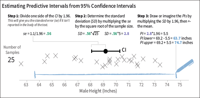 | Figure 3. Illustration of how to estimate a predictive interval (blue) from a 95 percent CI (black) that uses simulated heights of 25 randomly sampled men in the U.S. The interpretation of the predictive interval is that we have 95 percent confidence a randomly selected man in the U.S. would be between 63.7 and 74.7 inches tall. |
Beyond that, readers should bring a healthy skepticism when reading results sections. Think about what choices made in data analysis might have been approached differently and how this might affect results. Learn how to recognize when authors are using evidence of statistical significance as evidence for their own preferred hypothesis, rather than simply to rule out a null hypothesis, and take any conclusions drawn in this way with a grain of salt. Consider how degrees of freedom in the design of an experiment, such as through the design of stimuli, questions for participants, and other environmental features, might affect the authors' ability to show a hypothesized effect. Finally, understand the relationship between low power and overestimation of effects: The smaller your sample, the more likely that any effects you observe are overestimated. For tutorials in R for conveying distributional information in scientific findings, see [10].
References
1. Belia, S., Fidler, F., Williams, J., and Cumming, G. Researchers misunderstand confidence intervals and standard error bars. Psychological Methods 10, 4 (2005), 389.
2. Hofman, J.M., Goldstein, D.G., and Hullman, J. How visualizing inferential uncertainty can mislead readers about treatment effects in scientific results. Proc. of the 2020 CHI Conference on Human Factors in Computing Systems. ACM, New York, 2020, 1–12.
3. Hullman, J., Resnick, P., and Adar, E. Hypothetical outcome plots outperform error bars and violin plots for inferences about reliability of variable ordering. PloS One 10, 11 (2015), e0142444.
4. The data for the figures was randomly sampled from a simulated normal distribution with a mean of 69.3 inches and a standard deviation of 2.92 inches. These specifications are based on data for men in the U.S. ages 20 to 29 in 1999, reported in the third National Health and Nutrition Examination Survey and summarized by Schilling, Watkins, and Watkins [5].
5. Schilling, M.F., Watkins, A.E., and Watkins, W. Is human height bimodal? The American Statistician 56, 3 (2002), 223–229.
6. Kay, M., Kola, T., Hullman, J.R., and Munson, S.A. When (ish) is my bus? User-centered visualizations of uncertainty in everyday, mobile predictive systems. Proc. of the 2016 CHI Conference on Human Factors in Computing Systems. ACM, New York, 2016, 5092–5103.
7. Kim, Y.S., Hofman, J.M., and Goldstein, D.G. Effectively communicating effect sizes. Proc. of the 2020 CHI Conference on Human Factors in Computing Systems. ACM, New York, 2020.
8. Rafi, Z. and Greenland, S. Semantic and cognitive tools to aid statistical science: replace confidence and significance by compatibility and surprise. BMC Medical Research Methodology 20, 1 (2020), 1–13.
9. Steegen, S., Tuerlinckx, F., Gelman, A., and Vanpaemel, W. Increasing transparency through a multiverse analysis. Perspectives on Psychological Science 11, 5 (2016), 702–712.
10. Kay, M. ggdist: Visualizations of distributions and uncertainty. R package version 2.4.0, 2021; https://mjskay.github.io/ggdist/.
Author
Lace Padilla is an assistant professor in cognitive and information sciences at UC Merced. She studies decision making with uncertainty visualizations. Her work focuses on improving forecast visualizations to help people make high-risk decisions such as hurricane evacuation or managing Covid-19 risks. She is also a strong advocate for diversity, serving on the IEEE VIS Inclusivity & Diversity Committee and the Spark Society governing board. [email protected]
Copyright held by author
The Digital Library is published by the Association for Computing Machinery. Copyright © 2022 ACM, Inc.


Post Comment
No Comments Found