Authors: Joe Sokohl
Posted: Mon, January 05, 2015 - 11:58:06

To which Wright replied, "In time you'd grow tired of the sight of creek...but you'll never grow tired of the sound."
And he was right. Fallingwater stands as the most recognized house in architecture. Yet it's not just a landmark...it was a home. The Kaufmanns loved it.
Similarly, owners of other Wright-designed buildings may have struggled with the architect, the implementation may have had flaws, the builders and other constructors may have gone behind Wright's back to fix perceived design flaws...but they all loved the buildings. The architect's vision remains inspiration to this day.
For the past five years or so, I’ve been writing and presenting on the topic of how Wright’s work and life provide inspiration for my work in architecting experiences. Here I’m taking a look at three Wright landmarks: Fallingwater in Ohiopyle, the Pope-Leighy house in Alexandria, and Taliesin West in Phoenix. I believe that, through Wright's examples, we can learn elements that take our approaches to experience architecture to newly useful and inspiring levels for our clients and the users of our work.
Why these houses? Plain and simple: They showcase aspects of Wright’s interaction with clients, technical problems, and different contexts of use. Plus, I’ve visited them, studied them, and photographed them. In addition, they cover the gamut of Wright’s philosophy of architecture.
Fallingwater and “the box”
Undoubtedly Fallingwater is an iconic house. Yet the path that Wright took to create this house lies not just in the choices to cantilever the house over Bear Run, but the devotion to the experiences that the Kaufmanns and their guests would have.
Wright prepared for the designing of the house by immersing himself in the context. He spent hours getting to know E.J. and Lillian Kaufmann and Edgar Kaufmann Jr. (“Junior” spent time at Taliesin in Wright’s famous fellowship).
When Wright received the commission, he spent time walking the grounds where the Kaufmann’s wanted to site a weekend house near Bear Run—and specifically near a large, sloping rock next to a 15-foot-high waterfall.
After he returned to Wisconsin, Wright dispatched a team of draftsmen to make elevation drawings of every tree, boulder, bush, and rivulet in the site’s area...and then did nothing for three months.
Wright drew the entire concept in three hours while Kaufmann the client drove up from Chicago to Spring Green.
The key UX takeaway is that we need to have time to allow our concepts to gestate. Great design comes from spending time to do it. In addition, Wright’s focus on what clients want rather than what they need has parallels to our work. Our research needs to be detailed enough that we can postulate great solutions, not just pedestrian ones.
Experience architecture considerations
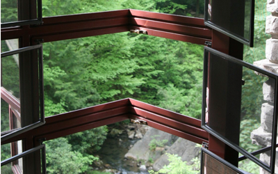
In working on the design for Fallingwater, Wright took into account how the family would use the property. Yet he also looked beyond what they had said outright and instead discovered what they really wanted. His casemate windows opened without a corner support, and he liberally used glass corners in both Fallingwater and Taliesin West, truly “breaking the box” of the traditional home. Wright’s famous retort to Lillian Kaufmann about Fallingwater’s placement highlights this. Wright could look beyond the Kaufmanns’ desire to look at the waterfall and cut to the core of their desire: to be in nature, not just at nature.

Other details at Fallingwater show his ability to design elements of the environment that would add to the Kaufmanns’ experiences there.
For example, the built-in kettle that would swing over the fire has an indentation that it fits in when not in use. This approach to available yet integrated design elements abounds throughout Wright’s designs.
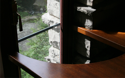
E.J. complained that the desk in his bedroom was too small; he wanted something bigger. Wright disagreed, saying that it was the right design. The client and architect went back and forth, until Kaufmann said, “I need a bigger space on which to write my checks to you.” So Wright came up with the innovative approach—instead of allowing the desk to block the window, or redesigning the window to open outward, he created the scallop in the desk.

In a similar way, when confronted with objections from clients or team members such as technologists, we need to seek innovative solutions to design problems. Rather than taking the easy path, Wright would have us find the right path for the context, the use, and the nature of the experience.
Context is king
As the Lao Tse quotation in Taliesin West’s music auditorium says, “The reality of the building does not consist in roof and walls but in the space within to be lived in.” You see this quotation as you ascend the staircase, and its prominence and inescapability highlight its place in Wright’s vision.
This commitment to an understanding of the context where experience occurs provides a keen, focused approach we can bring to our designs. We can seek inspiration from Wright by finding a third option when we’re on the horns of a dilemma. The approach to context answers well the question, how does the site selection integrate with user needs and desires?
When it doesn’t fit
Sometimes, a design conflicts with other elements of the experience. At Taliesin West, some of Wright’s favorite students gave him a vase as a present. He placed it on a shelf in the living room but the base was too big for the shelf.
He could have widened the shelf...but he said, “No, the shelf is correct.”
He could have asked them to replace it with a smaller vase...but he said, “No, the vase is correct.” Instead, he had a circle cut out of the glass so the vase would fit.
At the Pope-Leighy house’s construction, Loren Pope came up with design-altering solutions that Wright allowed to stand. After Wright left the site of his house while it was being constructed, Loren Pope convinced the builder to place the horizontally designed windows vertically in the kids’ bedroom. Though this step conflicted with Wright’s design, he allowed it to remain.

Sometimes, we need to understand when a design idea from the client does not destroy the entire design. As Wright said, “The more simple the conditions become, the more careful you must be in the working out of your combinations in order that comfort and utility may go hand in hand with beauty as they inevitably should.”
Posted in: on Mon, January 05, 2015 - 11:58:06
Joe Sokohl
View All Joe Sokohl's Posts


Post Comment
@slope game (2024 10 01)
It is important to know when a customer suggestion for a design does not have to sabotage the whole thing.
@lucidam (2025 01 13)
Escape Road features stunning 3D graphics that bring the urban environment to life, complete with realistic vehicles, towering buildings, and shimmering lakes.
@SDF (2025 05 12)
Discover the future of copper refining with intelligent cathode stripping machine solutions. Our automated systems achieve 99.8% peeling accuracy through advanced machine vision and force-sensing technology, processing 80+ plates/hour while eliminating manual exposure to hazardous environments. Explore how Industry 4.0 innovation is reshaping electrolytic copper production.