


Authors: Elizabeth Churchill
Posted: Fri, April 26, 2013 - 7:12:13
People have been declaring the death of email for decades. It is claimed that email is only used by fuddy-duddies, a dying breed of technologically challenged, uncool dinosaurs.
That would be me then.
And most of my friends and colleagues.
I am told that if I were hip, young, trendy, efficient … I would obviously choose to have all my information in small, digestible, unformatted chunks.
Maybe.
For me, email is the most versatile of all the channels I have available to me for asynchronous communication. It offers the richest range of options for crafting a message: short subject line only messages; long, carefully formatted messages with headers, font changes for emphasis, and bullet points; and plain text for short, tightly constructed messages. Note: I am staying well away from any discussion of whether email as a channel could do or should be given a sociotechnical overhaul in terms of interfaces, shared practices and so on. I will leave that point of view and ensuing discussions to the host of consultants, books, speeches, classes, and motivational posters that are dedicated to helping us “get control of our inboxes!” The problems these talented people discuss tend to be less about email as a channel, but focus on our behavior with email—its very versatility means it can get overused, even abused. I will note, however, that overloading can easily arise in other channels; my text stream can get pretty overwhelming and the stream of content that I see going by on Facebook makes my head spin.
Anyway, back to the point… Why have I been contemplating email so deeply of late? Because of the changes that Google wrought upon its Gmail Compose format about three weeks ago. The changes, we are told, are motivated by a desire to transform email and make it more like messaging.
“Co.Design argues that Gmail now competes with SMS, instant messaging and social networks, so Google had to simplify the interface "to keep up with the times."
I am not alone in my curiosity regarding these changes. From personal blogs to sites like Information Week, people are chirruping away sharing their views. Kate Crane–journalist, co-editor of Smashpipe (a fabulous new Web magazine), and the copy editor for ACM interactions–chatted with me about this for a story she is writing. Many people are upset, she says. She has some very compelling data to support this assertion.
Personally, I am somewhat upset. More than upset, though, I am curious about the design process that went behind the changes and with people’s reactions. I shared with Kate that, for me, there are three issues that need to be kept separate:
- Righteous indignation: a lot of people seem to be saying–or implying–that it is not appropriate for Google to change the Gmail interface. I don’t much like change either. I get irritated because change slows me down–at least until I learn the new methods. But I don’t think in this instance I have a right to stamp my feet. A company has a right to change the very useful service it offers us for free in whatever way it pleases. In my opinion, as a user of a free service I am not entitled to complain, although complain I do of course. Sure, I can vote with my feet and stop using the service. I suspect, however, that Google is making a bet that we will not all do that;
- Irritation: As usual, a Silicon Valley Internet behemoth demonstrates its epistemological arrogance with unfounded assertions about what is and what is not cool: email is going to go away so why don’t we nudge you dinosaurs into the 21st century where you can join us cool kids who know what modern communication should look like. This kind of attitude is certainly condescending and annoying, but it’s not new and it’s not surprising. And, to be fair, I haven’t seen this attitude stated explicitly. It’s just a general attitude that pervades the Internet industry–it’s just more of the same, business as usual for an environment that often places change and “innovation” higher than usefulness and interactional stability and consistency unless change interferes with the bottom line; and
- Bewilderment: The design seems to me to counter some very basic human factors and design principles. Note: I am not even asking for something that is aesthetically pleasing, which it is not, I just feel some basic human factors principles are being violated. I elaborate below.
As a number of others have pointed out, cognitively, the new interface disrupts the learned model, the interface that users have grown accustomed to. However, as has also been pointed out, people can relearn new actions with little difficulty. Fair enough. I am more curious about why routinely used, task-related features are hidden by default. Even after the new configuration has been learned, it remains the case that it simply takes more clicks to get to the formatting palette. It is an interface crime to insist people take extra action(s) to get to the functionality that was previously at their fingertips. (The only exception I make to this assertion is when safety-critical issues come to the fore, requiring intermediate steps and cautionary dialog boxes.)
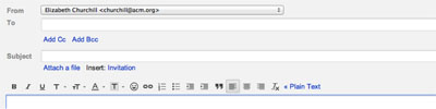
Figure 1a. The old Gmail formatting palette, directly below the To, Cc, Bcc and Subject text entry boxes
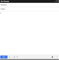
Figure 1b. Click on the A at the bottom of the window
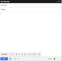
Figure 1c. After clicking on the A, a formatting palette appears
Let’s look at an example from the new Gmail interface, the formatting palette. Figure 1a shows the old interface; Figures 1b and 1c show the new one. As the screenshots show, I used to be able to, by default, leave the formatting palette visible. Now, whether I am a formatting palette frequent user or not, I have to explicitly open it every single time I open the Compose window. The default cannot be personalized to my preference. The rationale for this? It seems very few people use the formatting palette so hiding it is the solution:
Gmail's lead designer says that "a very small percentage of emails involve a formatting action," so that's the reason why you need two clicks instead of only one click to make text bold.
Hurrumph! It may be that only 1 percent (I made that number up) of the Gmail using population really want to use the features offered, but it’s really curious as to why they are not simply being offered the option to tailor their experience and have the formatting palette routinely available. Why make them work harder when an interface option is cheap? Why hide the palette by default requiring more actions when you can build in the flexibility to let the few who want it visible have it so?
I read on various blogs, and, as per the quote above, the decision was rooted in the belief that formatting is no longer needed for email, that formatting resides in the arena of formal documents, and that this move makes email more like messaging, less formal, reflecting the belief that formalities, like formatting, are no longer de rigueur. This strikes me as very odd. You don’t have to be an information designer, or a layout geek to know that people use formatting to structure information, to improve information consumption and comprehension, and to signal what is salient–underlining, emboldening, color contrast and a thousand other beautifully researched, explored, and elaborated forms of textual formatting and some of us like to use them a lot. Formatting is a basic mechanism for highlighting important content but leaving it in context.
And, sometimes a little formatting can be a social nicety too–you don’t have to be a proponent of the behavioral strictures of Jane Austen’s Victorian politeness landscape to want a little bit of formatting in your emails. I believe that, aside from visual information design aspects, there continue to exist sociocultural norms surrounding appropriate formats for certain kinds of communication. If you send me a job enquiry entirely in bold capitals in comic sans MS size 18 point font, you will certainly get my attention, but probably not in a good way. Similarly, if your job enquiry is telegraphic and in 140 characters or less, I many be similarly bemused. Formatting makes information more easily digestible and also can be used to signal awareness and respect for the social circumstances of the exchange.
So, why not let people tailor their digital environment to one’s personal tastes. Why make a statement that informal email should be the dominant model, inscribe that philosophy into your email Compose design, and insist that your viewpoint has to be encountered and overridden every time the tool is used?
Ok. Enough on that topic.
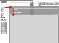
Figure 2a. Compose to address to cc/bcc to subject to writing text in the old Gmail interface
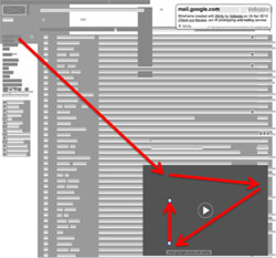
Figure 2b. Compose to address, to cc/bcc, to format palette to writing text in the new Gmail interface

Figure 3. Click on the arrow to release the Compose window so you can reposition it. Notably, this arrow to “pop-out” the Compose window exists in the old interface also.
To my second issue. While the formatting point is irritating, there are other features of the new interface that are possibly physically damaging. There are basic ergonomic issues with the new interface; it requires more traversal across screen real estate and more clicks to achieve the same result as the old interface. I did some direct comparisons: the new interface requires more perceptual and physical movement across my display screen (see the differences between the old interface and the new one in Figures 2a and 2b). One can release the display window from the bottom right by clicking on the arrow (Figure 3), and place it in an ergonomically favorable location. But this does require one to move the mouse, taking the cursor from the top left to the bottom right of the screen, click on the small arrow, and then grab the window and drag it to reposition it. These are the kinds of micro-movements that could lead to repetitive strain, strains that may not become evident for a while. When I first tried the new interface, I had to reconfigure my working setup so that my mouse could traverse the display real estate to achieve what I had previously down in a small jog to the right followed by a straight downward movement. The first few times I tried this, my mouse ran out of mouse-pad and had to be lifted and repositioned.
In trying the new interface out, I was reminded of that classic of HCI lore/law, Fitts law. According to Wikipedia, Fitts' law is
a model of human movement primarily used in human-computer interaction and ergonomics that predicts that the time required to rapidly move to a target area is a function of the distance to the target and the size of the target. Fitts' law is used to model the act of pointing, either by physically touching an object with a hand or finger, or virtually, by pointing to an object on a computer monitor using a pointing device. It was proposed by Paul Fitts in 1954.
It’s been a while since I actively used Fitts’ Law, but I relearnt from Wikipedia that one common form of Fitts’ Law is for movement along a single dimension:

where:
- T is the average time taken to complete the movement.
- a represents the start/stop time of the device (intercept) and
- b stands for the inherent speed of the device (slope). These constants can be determined experimentally by fitting a straight line to measured data.
- D is the distance from the starting point to the center of the target.
- W is the width of the target measured along the axis of motion. W can also be thought of as the allowed error tolerance in the final position, since the final point of the motion must fall within +/- W/2 of the target's center.
The equation tells us that there us a speed-accuracy trade off associated with pointing, where targets that are smaller and/or further away require more time to acquire. I was always told that Fitts’ Law was initially intended to be applied to new movements, not to highly practiced, skilled motions, but as the Wikipedia article points out, Fitts’ Law has been generally applied to both novel and practiced motions.
In any case, there are some very general rules that come from Fitts’ Law when it comes to designing interfaces: having to traverse more screen real estate and hunting and pecking for small GUI elements (remember the small A in Figure 1b that needs clicking on) takes more time and effort. So, as Wikipedia nicely summarizes: “buttons and other GUI controls should be a reasonable size; it is relatively difficult to click on small ones. They should be easy to acquire with whatever input device the user has (mouse, trackpad, trackball).” Increasing these kinds of motion also adds strain, a fact that many of us who spend too much time on a computer know only too well.
I do think the Google engineers were genuinely trying to make an improvement. But, for me, they have made a number of things worse. In the end, people likely won't abandon Gmail, but they may use a mail client with better options, using Gmail as their mail server but not using the Web interface. I’d love to see the data: how many people start to use mail clients that used to just directly use webmail. Maybe not a lot, but I suspect it is more than one (me).
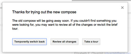
In any case, if you are a Gmail user but haven’t encountered the joys of the new interface yet, you may soon have to try it out–see the message from Google (Figure 4). People like me who swapped back to the old interface will be allowed to do so–temporarily.
Elizabeth F. Churchill is Director of Human Computer Interaction at eBay Research Labs in San Jose, California. She is also vice president of ACM SIGCHI.
Posted in: on Fri, April 26, 2013 - 7:12:13
Elizabeth Churchill

View All Elizabeth Churchill's Posts


Post Comment
@james s. (2013 06 03)
i’m using less now, didn’t like the change at all, and currently looking for new options… this new one is annoying
@Andrew Miller (2013 06 07)
Interesting post! For me, the changes have been mostly positive, and I am someone who formats text in email fairly frequently. However as an “expert” user, I’ve been using keyboard shortcuts to do most common tasks like bold, underline and italics. I would guess that’s another reason for the low utilization of point-and-click for these features. As for the compose window, it’s definitely further from the compose button. However, it’s a dramatic improvement when replying to an existing conversation, which I find myself doing much more frequently. Just a counterpoint and a reminder that an interface as complex as GMail involves many design tradeoffs. I wouldn’t automatically suppose Google’s designers have forgotten basic UX principles just because the changes are not universally better.
@saund (2013 06 07)
Thank you for the posting, I agree and I especially dislike the hidden cc: field.
Similarly with Microsoft. In interviewing 30 people about their document collaboration practices, a large number have still not recovered from the Ribbon interface of MS Office 2007, then 2010. The disruption goes beyond individuals not being able to find familiar tools buried behind multiple steps. When colleagues refuse to “upgrade”, document versions proliferate with incompatible application formatting.
@Alejandro Leone (2013 06 07)
Crazy thing is that gmail is free for general users (including like-chat young people) BUT not for companies who “go to google”.
Google Apps, a non-free service, is also affected for this crap. So I ask myself: BBVA is happy with it?
http://googleenterprise.blogspot.com.ar/2012/01/bbva-banks-on-google-apps.html
http://www.google.com/enterprise/apps/business/customers.html
@steinard (2013 06 07)
Hi!
I am the CTO in a technology company and we are paying customers using Google. Now all employees in our company (except one) have switched to email clients instead (Outlook), and we are looking for options, considering MS services instead. I am pretty sure that within one year, we will not be paying customers of Google, and we will likely not be using any of their services either.
Personally I think that Google has lost it’s innocence. You can see the trend of trying to harvest their market potential. Presumably this might be a consequence of declining income from their main business, advertisement on search, as I guess Facebook has taken a rather big share of the Internet advertisement business.
Google’s main product is information about you, you all who use their systems. They can (I am not saying I know to what extent) track your searches, access more information about you from your Google+ account and cross-link this. YouTube has become integrated and so forth. It is possible, to store large amounts of data about you, what you search for, what sites you visit, what interests you have, your background, your education, where you work, where you live, average housing costs in the area where you live, your likely income, where you want to go on vacation, where you went, etc, and from that deduct what products and services that can be advertised to you when you use any of their services (this is similar to what Facebook does). All it takes as a user to make this information gathering a lot harder is to delete cookies.
If users stop using the GMail web-client then google cookies will not be created that often, the Chrome browser and maybe even Google+, then it would become so much harder for Google to harvest such information. The bet here is on users not doing any of this, but making users unhappy increases the risk that more users do change their behavior, it increases the chances for some other service or program to appear and take a piece of the cake. What hurdles can such applications bring (like automatic deletion of other cookies etc).
Google themselves grew to the size they are today by offering users better services/products then their competitors did. If they don’t keep their edge, then that market share can just as easily be lost (although not in a wink). Therefor I think it is the users perfect right to complain to Google when they change something that they don’t like. After all, the users are feeding Google the information they need to make a profit on advertisement and search.
For all we know, Google might not be a big actor on the Internet in ten years, maybe their main concern is running power plants (they certainly show interest in that industry), who knows, take nothing for granted, make a local copy of your beloved mail!
@Christie (2013 06 08)
“In my opinion, as a user of a free service I am not entitled to complain,”
Whyever not? People offer “free” services because they get something from doing so. It might only be a feeling of satisfaction that people like what is being provided. It might be that they believe you will like whatever is being given away well enough that you will in the future pay for that or another product/service. Or, there might, as in Google’s case, be a financial reward that comes not from the direct users but from advertisers who wish to reach those users. In any case, an offer is made and accepted. Free or not, you are entitled to complain about the product or service, especially if what is offered is something that will have an ongoing role in your life. Any organization, be it a non-profit or a for profit business, is foolish to not listen when users of its “free” services become unhappy. We all have alternatives and users will seek out what best suits them. Google may be betting that only a tiny minority will leave, and they may well be right, at least in the short term. But I would bet that many people who stay because it is easier to stay than to leave will change from being enthusiastic Gmail users to resigned Gmail users who will no longer encourage others to try it and who will be highly susceptible to being enticed away should a new service come along that is getting some buzz.
Andrew - Since you could already pop out the compose window with the old interface and thus still have access to your inbox and any existing conversations, why do you consider the new, under-sized, poorly located, compose window that requires more clicks to do anything to be an improvement? Personally, I find having the inbox visible while composing to be a distraction. Under the old compose, it was available for those who wanted it and more traditionally not visible for those who didn’t want it. Now we ALL have to deal with it.
@leo wang (2013 08 19)
I cannot agree more. the new gmail interface absolutely sucks. I stopped use it more, try to find a good email client for that.
@ 5267471 (2013 10 01)
To revert to the old interface: http://webapps.stackexchange.com/a/50178/18147
@Pete (2014 04 18)
Great article! I think Google is trying to save money by trying to merge their desktop GUIs with mobile. Try again Google, you failed.. Reminds me of what MS did with 8. TIP: Try Gmail basic HTML to get back some old features, such as the full screen mail editor: https://mail.google.com/mail/?ui=html
@Slade Barker (2014 07 06)
ELIZABETH, could you UPDATE this column or at least add a NEW COMMENT below? I enjoyed this post because I despised the new Gmail interface the moment I tried to use it. I quickly switched back to the old interface. I did not stick around long enough to discover the flaws you cite, but they would have infuriated me, as I too use the features that supposedly nobody uses anymore. The big surprise for me is this idea that the old interface “is going away soon.” It is more than one year after this post, yet Google has still not taken it away from me. DID GOOGLE HONCHOS CHANGE THEIR MINDS? Or SHOULD I BE FRIGHTENED?
@lihyers (2025 04 21)
Email is truly the most flexible and expressive communication channel I use, but it can be easily abused if not controlled well. Being overloaded with messages and notifications from many different platforms also makes me “suffocate” sometimes. Luckily, Sprunki Retake is a quick entertainment when my mind is spinning with inboxes!