Authors:
Luke Hayman
Luke Hayman, the award-winning graphic designer whose work has transformed such titles as Time, The Atlantic, Consumer Reports, Cosmo, Travel + Leisure, New York, Folio, and even Communications of the ACM, was presented with a formidable task: Revitalize the look and presentation of a well-established 20-year-old magazine written by and for a community of designers working to enhance the way humans and technologies interact.
Hayman, and his team from the prestigious global design firm Pentagram, including Shigeto Akiyama and Ellen Peterson, took to the mission readily, working with Interactions' editors-in-chief Ron Wakkary and Erik Stolterman, and the magazine's editorial staff to digest where this magazine has been and its vision for the future. Here, Hayman describes what he feels are the key ingredients to a successful redesign and the thought and selection process that went into the contemporary redesign you now hold.
Redesigning a magazine, particularly a magazine like Interactions with a longstanding, firmly engrained presence, can be quite a challenge. Here, we are reevaluating and rethinking a design presentation for other designers to implement. Our goal is to provide a tool that can be used to create an identity, which we need to reinforce the content, establish a tone, make the magazine understandable, and distinguish it from other publications.
The systems we build need flexibility. Relying too much on templates makes for a visually repetitive experience. Rigid formats can be appropriate for a journal, but are often a missed opportunity for a magazine. The chance to play with scale and layout keeps the pages lively and helps to distinguish sections of the magazine as well as individual feature stories.
However, there must be limitstoo much freedom creates chaos. Some pages function better in a format. Readers become familiar with certain recurring pages, quickly learning to recognize them and hopefully look forward to them. A famous example is the last page of Vanity Fair magazine that features a celebrated name answering the legendary Proust Questionnaire. The layout and even the choice of illustrator remains unchanged from year to year. It becomes its own small franchise.
One of the special elements about a printed magazine is its physicality: It's an object and we can touch it. So we start there if we canlooking at the dimensions, proportions, and the paper stock. Some of these decisions are budget led and some aesthetic. We want the magazine to be distinctive, often moving away from generic sizes and paper as long functionality isn't compromised.
One of the most importantand often least noticeddecisions we make when redesigning a magazine pertains to fonts. There are literally thousands of typefaces to choose from. Fonts play a great role in the visual expression of a publication. They are most evident in the display elementsthe headlines, drop caps (large capitals at the start of a story), and page labeling.
This redesigned issue of Interactions employs the DIN typeface, which has an interesting pedigree. The font, originally designed for the Royal Prussian Railway Administration for lettering on rolling stock, later became a standard for the German Autobahn signage and then for vehicle license plates. The geometric forms were designed to be easily executed by engineers using nothing more than compasses and rulers. This unassuming, yet strong font communicates the idea of engineering and systems without being heavy handed. The versions used here have been redrawn and now come in a broader range of weights, which is useful for creating hierarchy. We were fortunate to discover a recently created template version that gives a "work in progress" feel representing process rather than finished product.
The chance to play with scale and layout keeps the pages lively and helps to distinguish sections of the magazine as well as individual feature stories.
For the body text we looked for something appropriate, legible, and distinctive. When determining body fonts, it is important to hold backwhich is often the hard part. The best text fonts for reading need to disappear once the reader dives in. Indeed, if you actually notice a text font there is something wrong! It will quickly become an irritation.
This piece is set in Antwerp. It's a recent font (released in 2011), but like many of the great ones we use today it's derived from an old printing type, in this case the work of the Belgium-based 16th century book printer and publisher Christoffel Plantin. Many of the newer, well-drawn fonts are typically available in a range of weights, whereas in the pre-desktop publishing days you would be lucky to get more than a regular, an italic, and a bold.
Once fonts are chosen and tested, preliminary grids are drawn up and sizes adjusted to create readable line lengths and an even tone across the longer passages of text. The pages are built from there adding the graphic elements, color palette, styles for infographics, headlines, subheads, pull quotes, and captions. These are the components that are working hard to draw the reader in. The eye gravitates to the visuals, and then moves to the captions, which should tempt the reader to linger and engage.
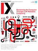
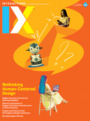
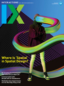
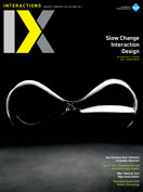
One of the biggest changes you may have noticed upon receipt of this issue is the magazine's logo or nameplate. The goal of this redesign was to clearly signal changeand we grabbed the opportunity. IX is our visual shorthand for Interactions, allowing us to use the letters large and often. The scale is dynamic and the construction of the X contains a notable chevron used as a connective agent that leaves its footprint throughout this new design.
I do hope you enjoy this issue of IX, err, Interactions.
Luke Hayman
 Figure. Pentagram's Luke Hayman (center), with Ellen Peterson (left) and Shigeto Akiyama (right).
COPYRIGHT HELD BY AUTHOR.
The Digital Library is published by the Association for Computing Machinery. Copyright © 2014 ACM, Inc.


Post Comment
No Comments Found