


Authors: Ashley Karr
Posted: Thu, June 13, 2013 - 10:48:11
Take away: Proper use of color can enhance the user experience of any design as color affects humans psychologically, physiologically, and emotionally.
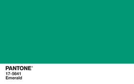
Emerald is: “Lively. Radiant. Lush. A color of elegance and beauty that enhances our sense of well-being, balance, and harmony.” Pantone named it 2013’s Color of the Year. I am glad that lively, radiant, lush elegance, beauty, and balance are harmonizing my experience during the 365 days that comprise 2013. However, this is a bold statement–just like the color. Can color really do all of this? The answers are yes and sort of. Please do read for further explanation.
Psychological effects of color
Color can augment memorization, recall, and recognition. In interactive designs, color can suggest categories and give identity to chunks of information. This can create a design that is more efficient, clearer and easier to understand, easier to learn, and easier to navigate.
Physiological effects of color
Colors affect our nervous systems. Research shows that, for example, bright reds stimulate our sympathetic nervous system, resulting in physiological changes such as an increased heart rate. In contrast, soft blues and greens create the opposite physiological effect and help us relax.
Emotional effects of color
Colors themselves and the meanings we attach to them affect our emotions and moods. For example, most people associate the color yellow with feeling happy and energized. On an individual level, a person could associate the color yellow with the color of their home during childhood, which invokes fond memories and pleasant feelings.
Cultural context of color
Remember that meaning in general is culturally constructed. Sensitivity to the cultural context and meaning of color within your user group is important. The following is a common example demonstrating the cultural implications of color. In many Western cultures, black represents death. In some Eastern cultures, white represents death. How this will affect one’s design and user interface decisions is up the design team; however, it is important to remember that we always operate within a cultural context. Our users do, too.
Quick guide to color and meaning from an American perspective
Red
- Increases blood pressure, heart and breathing rates
- Stimulates the adrenal and pituitary glands, which can temporarily increase strength and stamina
- Represents vitality, ambition, and passion
- Can dispel negative thoughts
- Associated with anger, danger, indebtedness and irritability
Pink
- Induces feelings of relaxation, tranquility, warmth, and protection
- Reduces feelings of aggression and irritation
- Associated with nurturing, selfless, generous love
- Light and soft pink associated with femininity, while bolder and hotter hues suggest youthful and fun energy
Orange
- Stimulates digestive and immune systems
- Associated with energy and vitality
- Younger audiences respond to bold oranges, while older and upscale audiences respond positively to softer hues
- Has only positive affects on mood, acts as anti-depressant
Yellow
- Stimulates the brain, creating alertness and energy
- Activates lymph system
- Happy, optimistic, confident, and uplifting
- Associated with the intellect, organization, discernment, memory, clarity, decision-making, and good judgment
Green
- Brings equilibrium and relaxation, feelings of comfort
- Helps us breathe deeper and slower
- Suggests nature, peace, well-being
- Deep shades suggest wealth
- Represents environmental friendliness
- Particular shades of green, such as olive, can represent illness and nausea
Blue
- Lowers blood pressure, has a cooling and soothing effect
- Deep blue stimulates the pituitary gland, which regulates sleep patterns, and is associated with calm, restful nights
- Inspires mental control, clarity and creativity
- An overuse of dark blue can be depressing
- Suggests the sky and ocean
Purple
- Violet suggests purification, cleansing, peace, and balance
- Combat shock and fear
- All hues help with mental and nervous disorders
- Stimulates compassion, intuition, and imagination
- Associated with the right side of the brain
- Relates to sensitivity, beauty, and idealism
- Associated with royalty and nobility
Brown
- Suggests earth and home and home, stability, and security
- Can also suggest dirtiness or retreat and isolation from the world
Black
- Comforting and protective
- Mysterious, suggests silence and death
- Can also be considered sleek and fashionable
White
- Purity, clarity, peace, and comfort
- Suggests freedom, although too much can be considered cold and isolating
Gray
- Suggests independence and self-reliance
- Can be a negative color, suggesting evasion and non-commitment, separation, lack of involvement, loneliness
Color use restrictions
- Overuse of color creates clutter and confusion. Find one color for your background, one that represents your brand or message, and two complementing yet contrasting colors that can act as indicators for active links, hovering, and visited links. This means a site should have a minimum of four colors. Any additional color should be chosen with care.
- Underuse of color results in a dull design lacking in interest and meaning. It can also result in confusion. Imagine trying to find a text embedded link that was the same color as the surrounding words!
- Improper use of color at worst can cause great offense. Remember color carries the weight of meaning, and this meaning is always wrapped in cultural contexts. Be aware of these meanings and use them, and their colors, with respect and purpose.
- Color blindness affects roughly 10% of the male population. Keep this in mind as you are choosing contrasting colors. If the colors you choose to serve different functions in your design do not suggest a stark enough contrast, a sizeable portion of your user group could be negatively affected by your choice.
How is color important in user experience?
Remember that user experience is overarchingly affective. Both objective and subjective evidence supports the concept that color affects humans psychologically, physiologically, and emotionally. Importantly, these effects come wrapped in cultural contexts. This means that the reactions that color evokes in us can change depending on the culture or cultures in which we were raised, currently reside, or are currently acting as a user. Selecting and using color with thought, purpose, and care can enhance the user experience. We would love to hear your experiences with color use and choice in your designs. Please write your comments below. Until next time, please enjoy the experience.
Posted in: on Thu, June 13, 2013 - 10:48:11
Ashley Karr

View All Ashley Karr's Posts


Post Comment
@Nick Fine (2013 06 25)
Where are your references? Much of this is regurgitated popular psychology without any evidence to support it.
@Benoît Larivière (2013 07 04)
Thanks.
I would add also that a tool such as Colour Contrast Analyser (Paciello Group) is helpful to ensure a proper legibility of the text.
@Steve Dolan (2013 07 14)
Great read! I wanted to add something I learned recently: When designing, choosing the style of your hyperlinks so that they easily stand out is important. I’m talking about beyond just changing the color, but also bolding and adding an underline makes a difference. The concept is, if you desaturate and blur your design, you want to still be able to tell where a link is located in your text.
@flix account (2016 03 20)
Color can have a really profound effect on humans, this article really made me realize the extent.
@نمایندگی بوتان در مارلیک (2023 07 11)
نمایندگی بوتان در مارلیک
https://www.faraztamir.com/marlik-butan/
@تعمیرات پکیج اندیشه (2023 07 20)
تعمیرات پکیج اندیشه
https://www.faraztamir.com/andishe-tamirat/
@سایت باربری آنلاین در ایران (2024 06 07)
سایت باربری آنلاین در ایران
سایت باربری آنلاین در ایران با رویکردی متمرکز بر ارائه خدمات حمل و نقل مطمئن و موثر، گزینهی ایدهآلی برای انتقال و جابجایی کالاها و اثاثیه خود میباشد. با تیمی مجرب و با تکیه بر فناوری روز، سایت باربری آنلاین در ایران امکان سفارش آسان و سریع خدمات باربری را فراهم میکند. از این پلتفرم معتبر میتوانید با اطمینان بیشتری به عملیات جابجایی خود بپردازید، زیرا تمامی مراحل از انتخاب بهترین باربر تا انجام حمل و نقل با ایمنی و دقت بالا انجام میشود. از طریق سایت باربری آنلاین در ایران، تجربهای ساده و مطمئن از خدمات باربری را تجربه خواهید کرد.
@Jenny (2024 07 09)
Memorization, recall, and identification can all be improved by color. Color can recommend categories and provide informational chunks a sense of identity in interactive designs. See: trellis christchurch
@ EBike Akku (2024 11 28)
Color and user experience
@google (2024 11 28)
Bei PowerSmart sind wir auf die Bereitstellung von erstklassigen Batterien spezialisiert, die sicherstellen, dass Ihre Geräte reibungslos und effizient laufen. Von E-Bike-Akkun über
@tablo (2024 12 12)
tablo decor
https://tablo-decor.com/
@Farshad salamat (2024 12 14)
Best furnace repair service in vancouver
https://bcrcheating.com/furnace-repair-in-vancouver/
@Rikhtegar (2024 12 14)
قیمت هر کیلو چدن ریخته گری
آیا میخواهید از قیمت هر کیلو چدن ریخته گری مطلع شوید؟ ما با استفاده از تکنولوژیهای پیشرفته، قیمتهای به صرفهای ارائه میدهیم. برای دریافت اطلاعات دقیقتر، همین حالا با ما تماس بگیرید و از تخفیفهای ویژه بهرهمند شوید
هزینه و قیمت ریخته گری چدن
آیا به دنبال بهترین قیمت برای ریخته گری چدن هستید؟ هزینهها به عواملی مانند نوع چدن، پیچیدگی و اندازه قطعات بستگی دارد. ما تضمین میکنیم که با ارائه بهترین کیفیت و قیمت رقابتی، رضایت شما را جلب کنیم. برای اطلاع از قیمتها و دریافت مشاوره رایگان، با کارشناسان ما تماس بگیرید.
سفارش ریخته گری چدن
فرآیند سفارش ریخته گری چدن در سایت ما بسیار ساده است. فقط کافیست با کارشناسان ما تماس بگیرید و مشخصات قطعه خود را ارائه دهید. ما با سریعترین زمان ممکن و بالاترین کیفیت، سفارش شما را تحویل میدهیم. برای شروع سفارش، با ما تماس بگیرید.
@Powder-market (2024 12 14)
قیمت هر کیلو پودر آلومینیوم
یکی از مهمترین عواملی که در خرید پودر آلومینیوم مدنظر قرار میگیرد، قیمت هر کیلو پودر آلومینیوم است. این قیمت به عوامل متعددی از جمله خلوص، دانهبندی و میزان تقاضا بستگی دارد. در سایت پودر مارکت، شما میتوانید از آخرین قیمت هر کیلو پودر آلومینیوم مطلع شوید و با اطمینان خرید کنید.
فروش پودر آلومینیوم با بهترین قیمت
پودر مارکت با ارائه پودر آلومینیوم خالص و با کیفیت بالا، در خدمت شما صنعتگران عزیز است. ما با ارائه بهترین قیمت پودر آلومینیوم و تضمین کیفیت، اطمینان شما را جلب میکنیم. برای اطلاع از قیمت خرید پودر آلومینیوم و دریافت مشاوره، با ما تماس بگیرید.
https://powder-market.ir/the-price-of-aluminum-powder/
@siavasharfaei (2024 12 15)
Thank you for this insightful post about the impact of color on user experience. As someone involved in designing user-centered interfaces, I find it fascinating how color influences emotions and behavior. At Sahel Choob, where we focus on crafting aesthetically pleasing and functional wooden furniture, we pay close attention to color schemes not only in our designs but also in presenting our products online.
For example, our website leverages warm, natural tones to align with the organic feel of our woodwork, creating a seamless and inviting user experience. I would love to know your thoughts on balancing functional color choices with brand identity in digital spaces.
Looking forward to more thought-provoking content!
@لوازم یدکی خودرو دنده مارکت (2024 12 15)
قطعات جلوبندی لاماری ایما
قطعات جلوبندی لاماری ایما مستقیماً بر کیفیت رانندگی و ایمنی تأثیر میگذارند. این قطعات شامل اجزایی مثل کمکفنرها، سیبکها، میلتعادل، بوشها و سیستم فرمان میشوند. خرابی یا فرسودگی در هر یک از این قطعات میتواند باعث کاهش تعادل خودرو، سر و صدای اضافی و حتی خطرات جدی در حین رانندگی شود. برای حفظ کارایی و ایمنی خودرو، بهتر است قطعات جلوبندی lamari را بهصورت دورهای بررسی کرده و در صورت نیاز، آنها را با نمونههای اورجینال و باکیفیت تعویض کنید. همچنین، نصب این قطعات باید توسط یک متخصص انجام شود تا از عملکرد صحیح و طول عمر بیشتر خودرو اطمینان حاصل کنید.
لوازم موتوری لاماری ایما در دنده مارکت
https://pinterest.com/pin/997265911233261588/
خرید لوازم یدکی لاماری ایما اورجینال از دنده مارکت
همانطور که گفته شد، ماشین لاماری ایما نیز مانند هر خودروی دیگری، به قطعات متعددی نیاز دارد تا به خوبی کار کند. اگر به دنبال لوازم یدکی اورجینال برای lamari خود هستید و میخواهید خریدتان را آسان و مطمئن انجام دهید، دنده مارکت یکی از گزینههای قابل اعتماد برای شما است. این فروشگاه با سابقهای طولانی، طیف وسیعی از قطعات را با قیمت مناسب و ارسال سریع به سراسر کشور ارائه میدهد. برای کسب اطلاعات بیشتر، میتوانید با کارشناسان دنده مارکت تماس بگیرید. همچنین لوازم لاماری ایما اصلی را می توانید در فروشگاه دنده مارکت به صورت حضوری نیز انجام دهید. برای اطلاع از جزئیات قطعات لاماری و آگهای از نظرات سایر خریداران، می توانید با رفتن به دسته بندی مربوط یا استفاده از قسمت جستجو سایتريال قطعه مورد نظر خودر را پیدا کنید.
@لوازم یدکی هیوندای و کیا شتاب یدک (2024 12 15)
تهیه لوازم یدکی اصلی سانتافه در تهران
فروشگاه های زیادی در تهران اقدام به فروش لوازم یدکی سانتافه می نمایند و متأسفانه ممکن است برخی افراد به دلیل سود بیشتر اقدام به عرضه محصولات فیک و بی کیفیت به عنوان قطعات اصلی نمایند. قطعات غیر اورجینال ممکن است در کوتاه مدت یا طولانی مدت باعث خرابی خودرو شوند. همچنین آسیب رساندن به دیگر اجزا خودرو سانتافه هم ممکن است با خرید قطعات بی کیفیت میسر شود. لذا توجه داشته باشید که لوازم خودرو خود را از فروشندگان با سابقه و مطمئن و در صورت امکان تخصصی خریداری نمایید. فروشگاه حضوری و اینترنتی شتاب یدک نیز با سال ها تجربه در زمینه فروش تخصصی لوازم یدکی خودروهای هیوندای و کیا، اقدام به عرضه کلی و جزئی قطعات انواع مدل های خودرو سانتافه می نماید. خرید آسان و مطمئن از مزایای فروشگاه شتاب یدک می باشد.
فروشگاه اینترنتی شتاب یدک به عنوان تامین کننده برتر لوازم یدکی سانتافه متمایز است. شتاب یدک که به دلیل محصولات اورجینال و رضایت مشتری شهرت دارد، مجموعه ای از لوازم یدکی سانتافه معتبر و باکیفیت را ارائه می دهد که طول عمر و عملکرد بهینه این خودرو را تضمین می کند.
خرید لوازم یدکی سانتافه 2008 – 2010 – 2015 – 2016 – 2017
هیوندای سانتافه خودرویی واراداتی بوده که در بین ایرانیان بسیار محبوب است. دارندگان این ماشین باید به صورت دورهای و منظم برای تعویض قطعات آن اقدام کنند. همچنین ممکن خواهد بود بر اثر تصادف نیاز به استفاده از قطعه جدیدی باشد. در صورتیکه قطعات خودرو پس از گذشت مدتی تعویض نشوند یا تقلبی و بی کیفیت باشد، عملکرد خودرو با مشکل روبرو خواهد شد. با به خطر افتادن ایمنی خودرو، جان سرنشینان هم به خطر خواهد افتاد.
https://pinterest.com/pin/922182461198527915/
برای خرید لوازم یدکی سانتافه 2008 – 2010 – 2015 – 2016 – 2017 – 2018 و تمامی مدل های موجود در بازار ایران باید به سراغ فروشندگان معتبر بروید. شما میتوانید انواع قطعات خودروی خود را با خیال راحت از فروشگاه شتاب یدک خریداری کنید.
نحوه خرید و قیمت لوازم یدکی هیوندا سانتافه
جهت اطلاع از قیمت و خرید لوازم هیوندا سانتافه اصلی تمامی مدل ها و با کیفیت و سایر قطعات کیا می توانید با فروشگاه تخصصی لوازم یدکی هیوندای و کیا شتاب یدک تماس بگیرید.
دقت کنید که در بازار لوازم یدکی هیوندای و کیا، عرضه قطعات فیک و بی کیفیت با قیمت بالا ممکن است بسیار باشد. لذا سعی نمایید از فروشگاه های معتبر که به ارائه تخصصی قطعات هیوندای و کیا می پردازند، خرید نمایید.
هدف فروشگاه تخصصی شتاب یدک، عرضه لوازم یدکی اصلی و با کیفیت خودروهای هیوندای و کیا با مناسب ترین قیمت و ارسال به سراسر ایران می باشد.
@مسکن کادوس (2024 12 15)
جهت خرید باغ ویلا ارزان قیمت به وب سایت مجموعه کادوس مراجعه نمایید.
@مسکن کادوس (2024 12 15)
خرید آپارتمان در شهرک صدف یکی از بهترین روش های سرمایه گذاری می باشد شما می توانید جهت خرید آپارتمان در شهرک صدف با مسکن کادوس درارتباط باشید.
https://maskankadus.com/listing-location/andishe/sadaf/
@zohrehamini (2024 12 15)
Hi; I am zohreh. I am very happy to be able to share my knowledge with you.