


Authors: Eshtiak Ahmed, Ashraful Islam, Farzana Anowar
Posted: Fri, February 25, 2022 - 12:30:00
Recent increases in smartphone users have resulted in a great diversity of backgrounds and cultures among these users. Designers of smartphone elements need to address this diversity by making design elements more uniform and acceptable for all. The user interface should address the needs and level of understanding of all users. In this study, we focus on a new approach to the design of user interface icons and investigate how careful design can help users have more seamless interaction with interfaces.
As of the first quarter of 2021, the Google Play Store has the highest number of apps [1]. In the Google Play Store, different app categories are specified by a category name and a simple graphical representation beside the text. Though the text itself is self-explanatory, the graphical representations do not represent the categories well. This may not be a problem for someone who can read English, but it is very hard to grasp the category purely based on the pictorial depiction [2]. It is quite common for people to have trouble finding the app they are looking for [3]. The goal of this research is to see if app categories can be represented more efficiently with better icons or graphical representations next to them.
Initially, new icons were designed for some selected categories. A public survey was designed and circulated where the participants were asked to tell their preferred icons for a specific category. A total of 664 responses were collected. According to the results of the survey, distinguishing factors were identified in how graphical representations can be represented more conveniently. The detailed information and findings of this study can be found in one of our published works [4].
App store category selection
Apps in the Play store are divided into more than 35 categories. The list of categories consists of the category name and a small category icon beside it. These category icons are often confusing and misleading, making them useless at times. However, not all the icons are poor and some of them are quite helpful. For this study, 10 different app categories were selected based on their abstractness and readability: arts and design, business, communication, entertainment, finance, lifestyle, personalization, social, sports, and travel and local.
Icon design
Our goal was to design icons in such a manner that people with low literacy, senior citizens, and kids with special needs can easily understand what they stand for, potentially allowing them to find what they are searching for. While designing the icons, we wanted to represent each category with relevant objects that belongs to that category, for example, representing the sports category with elements from popular sports. In Figure 1, we show the 10 selected categories along with their current icons in the Play store, as well as the icons we have designed for them.
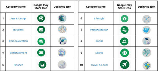
Figure 1. Side-by-side comparison of existing and newly designed icons.
Survey design and participants
After completing the icon design, a public survey was designed to get feedback from smartphone users about the newly designed icons. For each app store category, two icons (newly designed and existing icons from Google Play store) were put alongside each other, and the participants were asked to decide which icons they preferred for each category. The survey collected a total of 664 responses; 513 (77.3 percent) were male and the rest 151 (24.7 percent) were female. All participants were between the ages of 21 and 25.
Findings
The public survey provided a very good idea of whether the newly designed icons represent the categories better or not. Figure 2 shows the overall survey result comparing the participants’ preference for icons in each of the 10 categories.
The newly designed icon for the arts and design category was preferred by 88 percent of the participants. The new business category icon was preferred by 90.8 percent of participants, while the new icons for the communication, entertainment, and finance categories were preferred by 84.3 percent, 95.5 percent, and 95.9 percent of participants, respectively. The new lifestyle category icon was preferred by 93.1 percent of participants.
Some of the newly designed icons received mixed responses, as they were tough to represent by a small piece of art. These included the newly designed icon for personalization category, which was preferred by 64.8 percent of participants and the new icon for the social category, which was preferred by 71.2 percent of participants. Also, the new sports category icon was preferred by 82.7 percent of participants, while the new travel and local category icon was preferred by 72 percent of participants.
Challenges and discussion
The new icons were designed by using real-world objects from each category. As an example, the sports icon was designed by combining the equipment from three popular sports. However, similar types of categories such as finance, business and communication, and social were challenging because there are fewer distinguishing factors between them. The lifestyle and personalization categories were also very challenging because of their abstractness.
Icons were created using the objects that came to mind for each category. Sometimes, however, the new icons might have seemed too crowded, as so many objects were cramped into a tiny circle to make the icon understandable. Another shortcoming is that the survey participants are mostly young smartphone users. A more thorough survey covering different age groups could create a different dimension of results.
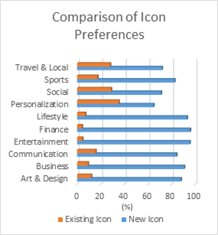
Figure 2. Analysis of results obtained from the conducted survey.
Conclusion
This study promotes designing an effective textless user interface so users can integrate with their devices more easily and more effectively. Creating impactful and meaningful icons could be a great step toward text-free interface in smartphones. This work could be extended by representing a user interface that is self-explanatory and interactive, opening new doors for challenged users.
Endnotes
1. Statista. Number of apps available in leading app stores. Retrieved August 21, 2021 from https://www.statista.com/topics/1729/app-stores/#dossierSummary__chapter3
2. Wiebe, M., Geiskkovitch, D., Bunt, A., Young, J., and Glenwright, M. Icons for kids: Can young children understand graphical representations of app store categories? Proc. of the 42Nd Graphics Interface Conference. Canadian Human-Computer Communications Society, 2016, 163–166.
3. Wang, M. and Li, X. 2017. Effects of the aesthetic design of icons on app downloads: Evidence from an Android market. Electronic Commerce Research 17, 1 (2017), 83–102.
4. Ahmed, E., Hasan, M.M., Faruk, M.O., Hossain, M.F., Rahman, M.A., and Islam, A. 2019. Icons For the mass: An approach towards text free smart interface. Proc. of the 2019 International Conference on Advances in Science, Engineering and Robotics Technology. 2019, 1–4.
Posted in: on Fri, February 25, 2022 - 12:30:00
Eshtiak Ahmed

View All Eshtiak Ahmed's Posts
Ashraful Islam
View All Ashraful Islam's Posts
Farzana Anowar
View All Farzana Anowar's Posts


Post Comment
@Misen (2024 07 22)
New wordle icons were designed for 10 categories: arts and design, business, communication, entertainment, finance, lifestyle, personalization, social, sports, and travel and local.
@Free AI Tools Free AI Tools (2024 12 16)
Thanks for this article, it is well written Remote Software JobsFree AI Tools
Latest Merch Deals Thank you for sharing=
@Brandon3783 (2025 04 24)
Zeus AI may offer full-time or freelance positions for software engineers, AI researchers, and ML experts. Check their official website or LinkedIn for career opportunities. click to learn more
@Ellis Jack (2025 06 28)
When I started analyzing app store icons from a user perspective, it became clear how much clarity impacts engagement. Redesigning category icons with intuitive medical coding and billing services visuals helped users find what they needed faster. A user-centric approach doesn’t just enhance aesthetics—it improves functionality, discoverability, and overall satisfaction in the digital experience.
@adam223 (2025 06 28)
This is a smart and much-needed approach! Clear and intuitive category icons can significantly enhance user experience by making navigation easier and faster. A user-centric design not only improves accessibility but also boosts app engagement and satisfaction. Online Casino Schweiz Echtgeld