


Authors: Jessica Hullman
Posted: Mon, August 05, 2019 - 3:10:09
Few people in visualization research have had careers as long and as impactful as Ben Shneiderman. I caught up with Ben over email in between his travels to get his take on visualization research, what’s worked in his career, and his advice for practitioners and researchers.
Jessica Hullman: How would you answer the question: What is visualization research?
Ben Shneiderman: First let me define information visualization and its goals; then I can describe visualization research.
Information visualization is a powerful interactive strategy for exploring data, especially when combined with statistical methods. Analysts in every field can use interactive information visualization tools for:
- more effective detection of faulty data, missing data, unusual distributions, and anomalies;
- deeper and more thorough data analyses that produce profounder insights; and
- richer understandings that enable researchers to ask bolder questions.
Visualization research seeks new visual displays, control panels, features, and workflows that improve the capabilities of users. To accomplish these goals, visualization researchers develop perceptual and cognitive theories that guide design, in concert with developing new tools. Visualization researchers also develop quantitative and qualitative evaluation methods to validate their hypotheses and refine their theories.
My strong way of promoting information visualization is to declare that it is such a powerful amplifier of human abilities that it should be illegal, unprofessional, and unethical to do data analysis using only statistical and algorithmic processes. (However, as with all visualizations, the accompanying design has to account for users with visual disabilities by using sonification or other methods. Visualization’s potency in revealing unusual distributions and interesting clusters may productively encourage statistics and algorithm designers to extend their methods to detect these patterns as well as incorrect, anomalous, inconsistent, and missing data.)
And finally, remember that: the purpose of visualization is insight, not pictures. By addressing meaningful problems and difficult decisions, we can help leaders and managers to be more effective.
Hullman: You’ve obviously made some major contributions to human-computer interaction and visualization research. Take, for example, direct manipulation and dynamic queries, two foundational concepts. Can you give us a sense of what it was like to be “pioneering” back when visualization was still a nascent field?
Shneiderman: I see direct manipulation as providing key principles which still guide design of most new technologies:
- Continuous representations of the objects and actions of interest with meaningful visual metaphors
- Physical actions or presses of labeled interface objects (e.g., buttons, sliders, etc.) instead of complex syntax
- Rapid, incremental, reversible actions whose effects on the objects of interest are visible immediately.
My recently published book Encounters with HCI Pioneers: A Personal Journal and Photo History (Morgan & Claypool Publishers, 2019) tries to tell the story of how the field of human-computer interaction was formed and the bold, creative, and generous personalities who were involved.
Hullman: How do you perceive the work that you and your collaborators have done in these fields? For instance, how do you describe the contributions of your work when talking to people who don’t know these fields very well?
Shneiderman: The easiest stories to tell at airport encounters and dinner parties are about the creation of the 1) web link: a form of direct manipulation selection by clicking on highlighted links and 2) the high-precision touchscreen strategy for small keyboards called lift-off, which is still used on the Apple iPhones and many other devices. These two small innovations have had a huge impact, enabling billions of users to have easier access to information, be in communication with family, get medical care, and much more. These innovations and their evaluations were published openly with no patent protection, allowing widespread refinement and application. I thought they were both important and valuable, but I did not anticipate the immense impact they would have, nor that they would become so common and obvious to so many users.
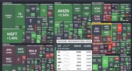
Treemaps used in FinViz.com, 2019.
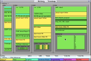
Early implementation of the treemap for hard drive overview.
Other satisfying stories are the widespread use of our network analysis and visualization tool, NodeXL, which pioneered new layout strategies that more clearly showed meaningful clusters and communities. The six patterns of Twitter discussions were an important insight: NodeXL is the most widely used tool for education about network analysis; our book on its use will appear in second edition in 2019. The striking example below shows the polarized voting pattern in the U.S. Senate. The tightly linked red Republican Senators are at the top, while the tightly linked blue Democrats are at the bottom. The two green Independent Senators typically vote with the Democrats
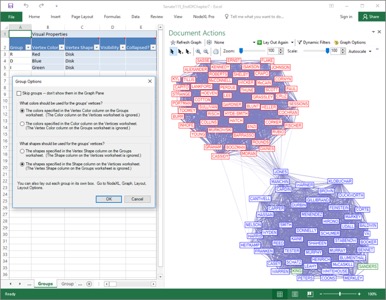
A visualization of voting patterns in the U.S. Senate created using NodeXL.
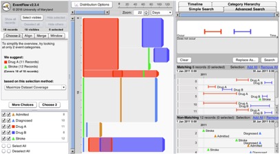
A visualization in EventFlow.
Shneiderman: Yes, my students! My greatest satisfaction was to work with Catherine Plaisant for 30-plus years to train a new generation of students who did projects, earned degrees, and went on to do great work on their own. We engaged with students in ways that promoted their self-efficacy to build their capacity and confidence as researchers and practitioners. The University of Maryland Human-Computer Interaction Lab (HCIL) community encouraged collaborations to improve the research, writing, speaking, and social skills of each member. Paper clinics to review each other’s writing and practice talks to improve slide presentations became common formats in which faculty, staff, and students worked hard to improve the products and skills of every HCIL member.
Hullman: If readers were going to read one thing you’ve written, what would you recommend and why?
Shneiderman: If they are serious, they should read the 6th edition of Designing the User Interface: Strategies for Effective Human-Computer Interaction, but that is asking a lot. An easier starting point would be the 1996 paper “The Eyes Have It: A Task by DataType Taxonomy of Information Visualizations” (Proc. IEEE Symposium on Visual Languages ’96). This keynote paper was hastily written close to the publication deadline, but the ideas were fresh and my informal phrasing of what I called the Information Visualization Mantra (overview first, zoom and filter, then details-on-demand) has attracted many readers. The simple ideas in this paper, presented at a second-tier conference, has received more than 5000 citations.
Hullman: At a few times in its history the visualization community has reflected on its value to the world, sometimes using terms like the “death of visualization” to refer to the way the research community has evolved from existing to help other scientists solve problems to existing more independently. What’s your take on the state of visualization research today? Are we past any risk of being irrelevant? Are we focused on the right things?
Shneiderman: I have strong confidence in the importance of information visualization, but it will take a generation for it to gain acceptance by diverse audiences. Our challenge is to show how algorithmic and automatic approaches based on statistical methods can be improved by interactive information visualization. Just as telescopes, microscopes, cameras, x-ray machines, and sonograms extend our perceptual abilities, information visualization amplifies our cognitive abilities. We will need to shift education curricula in elementary and high schools so that they teach data visualization literacy and fluency with interactive information visualization tools.
Hullman: You have always advocated for visualization research that has a real and practical impact in the world. How do we make visualization useful and relevant for practitioners? And what is the best way to bridge gaps between people who do research in visualization and those who use visualization in their profession (designers, analysts, product developers, etc.).
Shneiderman: By working with practitioners, information visualization researchers can accelerate their research by testing their tools and methods on real problems. The evidence is clear that the payoff for working with practitioners is strong. It is also very satisfying to help others and I find that our work has immense value in dealing with real problems whose solution promotes understanding and improves lives. Several of us make the case in the paper “Apply or Die: On the Role and Assessment of Application Papers in Visualization.”
Hullman: Is there anything (else) you think visualization researchers should do more of?
Shneiderman: Have fun in your work, do your best to save the world, and tip your drivers generously.
Hullman: A few years ago there was some discussion among visualization researchers about whether visualization research had “grand challenges” in the same way that other fields have (e.g., NP-hard problems in more formally theoretical subfields of CS). Do you have any thoughts on this question? Are our problems as well defined and all encompassing as those in other branches of computer science? Or are visualization and human-computer interaction research fundamentally different, and if so, what would you say is the important difference?
Shneiderman: The information visualization community is working on some of the grandest challenges of our time: amplifying human cognition in the exploration of data. Data science and explainable artificial intelligence are clearly among the biggest opportunities of our time—information visualization is vital to successful outcomes for both topics. We’ve made important contributions and had high impact already, but our influence will grow as visualizations become more important parts of products and data visualization literacy grows. Other grand challenges for information visualization researchers are to improve storytelling capacity for the general public, to engage users to explore on their own, and to support researchers in understanding causality. A larger challenge is to encourage the shift from rationalism, which assumes that algorithms are the answer, to empiricism, which assumes that continuous exploration, persistent questioning, and vigorous dialog will promote a deeper understanding of our world.
Hullman: These days many people are drawn to work with visualization but may not know how to best contribute. What advice would you give a new Ph.D. student who wants to have a real impact on visualization use in the world?
Shneiderman: Start by working on a real problem—one that you have or that you get from someone else. Working on real problems leads to better theories and better tools.
Hullman: What about a visualization practitioner, like a designer or developer?
Shneiderman: Build something, test it, improve it, and then do it again on another problem. Keep producing, keep working to serve the needs of real users working on real problems with real data.
Hullman: What about someone who is already doing visualization research, say in their early to mid career (like my colleagues and I!) Sometimes it’s hard to decide between problems to devote one’s time to, and to know how much one should care about trying to increase one’s metrics (citations, etc.) so as to achieve greater “visibility” versus to work on the problems that seem most important, even if they are not considered “core InfoVis topics” (uncertainty visualization being one example that comes to mind). How did you choose your problems? Did you ever experience any tension between the problems you wanted to work on and those that the research community thought were important?
Shneiderman: While I did have topics that I was attracted to, I invested greater time and energy where there was a person who cared about the result. Working to serve the needs of a real person raises the value of your work and focuses your attention on real problems, not the imaginary ones you invent. My 2018 paper “The Twin-Win Model: A Human-centered Approach to Research Success” showed that papers written with a non-academic co-author produced 2 to 10 times as many citations as papers that had only academic authors.
Hullman: Do you have any personal heroes, or people you look up to?
Shneiderman: Heroes in our field: Stu Card was always a wonderful colleague whose work was deep and important. Current leaders that really impress me are Maneesh Agrawala, Katy Börner, Jeff Heer, and Tamara Munzner, who are remarkably productive, creative, and influential. Also the amazing team of Fernanda Viegas and Martin Wattenberg—constant sources of brilliant and beautiful projects.
Larger figures: Marshall McLuhan, Buckminster Fuller, Lewis Mumford, Rachel Carson, Donald Knuth, Grace Hopper, Mihaly Csikszentmihalyi, Rita Colwell, and Walter Isaacson. A few years ago Robert Kosara invited me to write a longer list of those who influenced me.
Hullman: Can you tell us a bit about what you’re thinking about now? What problems have most motivated you recently?
Shneiderman: I still see big opportunities in medical applications:
- Analyses of electronic health records to support clinical research that detects successful treatment patterns,
- Personal data from patients who are tracking their disease and health, and
- Wellness data, such as exercise, diet, stress, sleep, etc., from quantified self users.
I’ve also been addressing policy issues in talks such as "Algorithmic Accountability: Design for Safety," and writing about human-centered design philosophies to guide new technology. My 2016 book The New ABCs of Research: Achieving Breakthrough Collaborations continues to draw invitations to speak, while suggesting new ways to raise research impact by choosing the right problems and forming the right teams.
Hullman: Any parting thoughts you’d like to leave us with?
Shneiderman: Visualization is a powerful approach to understanding the world, so we enjoy our work to make it more central to research, education, journalism, and public policy. It will take time and energy, but embrace the struggles, take on the challenges, and celebrate your successes. These are worthy efforts.

Ben Shneiderman in Torres del Paine National Park in Chile, January 2019.
Ben is the co-author with Catherine Plaisant of Designing the User Interface: Strategies for Effective Human-Computer Interaction (6th ed., 2016). With Stu Card and Jock Mackinlay, he co-authored Readings in Information Visualization: Using Vision to Think (1999). His book Leonardo’s Laptop (MIT Press) won the IEEE book award for Distinguished Literary Contribution. He co-authored Analyzing Social Media Networks with NodeXL (Elsevier, Second Edition 2019) with Derek Hansen and Marc Smith. The New ABCs of Research: Achieving Breakthrough Collaborations (Oxford, April 2016) has an accompanying short book Twin-Win Research: Breakthrough Theories and Validated Solutions for Societal Benefit: Second Edition (2019). His reflections on the growth of human-computer interaction will appear in 2019: Encounters with HCI Pioneers: A Personal Journal and Photo History (Morgan & Claypool Publishers).
Posted in: on Mon, August 05, 2019 - 3:10:09
Jessica Hullman

View All Jessica Hullman's Posts


Post Comment
@Drywall (2024 05 16)
How did you choose your problems?
How to choose a reliable drywall contractor?
@google (2024 11 28)
Willkommen bei PowerSmart, wo Sie hochwertige Akkus für HP Laptops und Dyson Akku Staubsauger finden.
@Michael Robles (2025 03 02)
Nice to read the detail about the purpose of visualization is insight, not pictures: An interview with Ben Shneiderman and it is good to have such detail with amazing ideas. By using the services like aire acondicionado Badajozwe can get the solutions that we are required to. It is good and helpful.
@bevis0405 (2025 04 09)
The immersive gameplay in Worldguessr helps players develop pattern recognition skills when identifying different locations.
@Sola (2025 05 22)
It was great to have the opportunity to talk to Ben Shneiderman, one of the most influential researchers in the field of data visualization. His knowledge and experience will definitely be valuable to those who are pursuing or interested in this field. hole io
@Peter (2025 05 28)
Great interview — the emphasis on insight over aesthetics really resonates. In my work on currency exchange rate visualization, I’ve found that clear, dynamic data presentation can influence real-time decision-making, especially in volatile markets. For example, this live tool tracking the SAR to EGP is built to prioritize clarity and trend visibility over decorative design. Would love to hear thoughts on how to better balance insight and simplicity in financial data tools.
@Brad Pitt (2025 06 17)
retro bowl brings the American football matches to players as they become a head coach of the team.
@Sarfegp (2025 07 05)
Thanks for sharing such valuable content. This platform is a great resource for tracking live Euro to EGP rates in the open market. Whether you’re monitoring currency trends or planning an exchange, it provides up-to-date data and helpful tools to make informed decisions. https://sarfegp.com/eur/
@dubai25 (2025 07 14)
Strengthening partnerships with global corporations, investors, and entrepreneurs to enhance Dubai’s status as a major global trading hub and an attractive market for establishing and expanding businesses.
dubai international business
@Slot Deposit QRIS 5ribu (2025 08 01)
Slot Gacor Gampang Menang sebagai agen slot deposit QRIS terbaik pastinya menghadirkan berbagai macam pilihan permainan slot online terbaik dari banyak provider slot online terkenal seperti Slot Pragmatic Play / Zeus Deposit QRIS, slot mahjong Qris 10ribu, C9, Slot Ygg, Slot JILI, dan masih banyak provider slot gacor yang bisa kamu mainkan disini, dengan berbagai cara deposit bisa kamu mainkan, mulai dari slot deposit dana, slot gacor via dana, slot online depo gopay, dan masih banyak lagi.
Tidak perlu ragu untuk bergabung dengan Situs slot gacor Deposit QRIS karena semua kemenangan yang kamu dapatkan dari bermain slot online gacor tentunya pasti akan dibayar full, dapatkan juga bocoran parlay bola, RTP slot online hari ini yang paling up to date, serta slot deposit dana yang akan diproses dalam kurang dari 2 detik.
Selain slot online gacor tentunya masih banyak lagi permainan online yang bisa kamu mainkan disini, mulai dari casino online, tembak ikan online, poker online, capsa susun online, slot depo qris 5k,judi bola online ataupun sportsbook online, hanya dengan daftar 1 akun slot di situs slot gacor via dana tentunya sudah bisa main semua permainan yang ada di agen slot gacor yang satu ini.
@Ahmed Daniyal (2025 09 09)
This interview with Ben Shneiderman offers profound insights into the essence of data visualization. His emphasis on prioritizing insight over mere aesthetics resonates deeply. For those interested in land records and property rights in India, resources like Ladki Bahin Yojana and Patta Chitta provide valuable information.
@Sarfegp (2025 10 08)
Really enjoyed reading your post! Your insights on “Take the A-Train” are very interesting and engaging. For readers looking for more useful online resources, you can check out:
https://veduappdownloadapk.org/
– a platform for discovering trending apps and tech updates.
https://swamivivekanandascholarship.org/
– a helpful site for students to apply online for the Swami Vivekananda Scholarship.
Keep up the great work and thanks for sharing such informative content!
@Parivahan Sewa (2025 10 13)
Interesting perspective! “The purpose of visualization is insight, not pictures,” really emphasizes the value of understanding over aesthetics. For streamlined access to government transport services, check out https://parivahan-sewas.org/
@Johnson (2025 10 22)
It’s fascinating how he emphasizes the importance of interactive visualization for data exploration, especially when combined with statistical methods. His point about visualization being illegal if not used resonated deeply. Seems like there are ways to improve at Slither io. I once tried to analyze customer feedback for a new product using just spreadsheets and ended up completely lost in the numbers. It was only when I visualized the data with a treemap that the key insights became clear.
@PM Kisan (2025 10 24)
Thoughtful visualization isn’t just about pretty charts—it’s about meaningful insight. The PM Kisan Yojana in India similarly focuses on empowering farmers through direct support, ensuring the roots of agriculture stay strong and sustainable.