Authors:
You occasionally see complaints that adding usability makes interfaces ugly, or that proponents of usability ignore beauty.
I believe that part of this misunderstanding comes from our use of the word "invisible" to describe a desirable interface. But of course, we use "invisible" in a metaphorical way, to mean that the interface is not perceived as a separate artifact of a system. I'm sure another part of the misunderstanding comes from fights between graphics designers and usability proponents over whether usability or graphics design is more important to a product's success.
Usability is about improving three things: doing your task faster, getting it right, and enjoying it more. So is a plain, unadorned user interface any different in usability from a graphically sophisticated one?
At first glance, more graphics are not going to make you faster, or more correct, but they may allow you to enjoy it more. But this in turn may have a positive feedback, and therefore make you work faster and/or more correctly. Or it may distract you, and slow you down or cause you to make mistakes. So it's difficult to tell a priori how much aesthetics adds to usability (which is why we have to do user testing) and there has not been very much discussion on the topic.
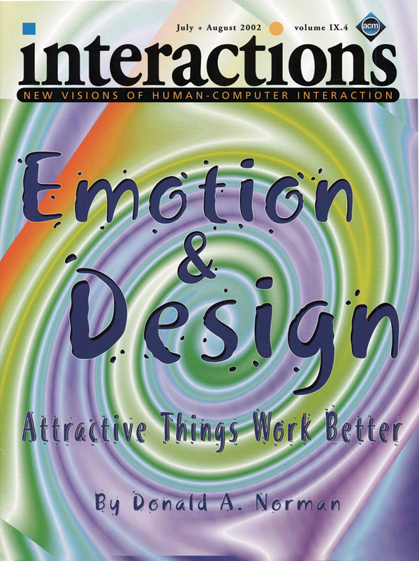
In this issue Don Norman explores the tensions, perceived or real, between aesthetics and usability, and explores the different roles affect (roughly speaking, emotion) and cognition play in that tension. Could it be that beauty improves usability in some cases and decreases it in other cases? Read Don's article to find out.
Steven Pemberton
[email protected]


Post Comment
No Comments Found