


Authors:
Steve Harrison, Deborah Tatar

On January 1, 2023, the weather app Dark Sky ceased working. Many apps provide weather information and forecasts, but Dark Sky showed what thoughtful information design can do.
Insights
→ We lament the loss of Dark Sky's deceptively simple interface that delightfully delivered hyperlocal weather information.
→ Focusing on "features" can blind us to quality.
→ By designing systems that resonate with rich human situations of use, interfaces can implement beneficial values and reflect humans' better natures.
We lament the loss of its "hyperlocal" information; we lament how it created extrapolations of surrounding weather sources and current patterns; and above all we lament the loss of its interface. The interface made Dark Sky the first thing we would turn to. To borrow from Vitruvius, it had "commodity, firmness and delight." Commodity here means utility. Firmness means engineering. And delight means…delight. Enough delight to know that "firm" engineering does not mean just engineer values, and that utility does not always rest in being as complete and accurate as possible in every instant.
Dark Sky was a great example of designing for a situation of use. A first quick glance at the main screen showed what you actually wanted to know at first glance. That is to say: not everything. This is an important purpose. Imagine a cyclist grasping their iPhone after noticing a threatening sky and then thrusting the phone back into their pocket. It's also no small design accomplishment. The plain, minimalist display had everything you needed: the current temp alongside a simple icon, and a wide-format weather map. Notifications from the National Weather Service showed up in red, in the upper center of the screen. This was the only significant use of color contrast in the interface, and it was kept for what is, objectively, the most important information. Of course, if there was no advisory, there was no red. If there was any rain in the next hour, you saw a pulsing, splashing blob in shades of blue on a timeline. The timeline was only animated if rain was expected. It drew the eye when important, and the experience felt like rain. Minimalist and fun—what more could you ask for!
Below this was a small radar map, and then a column of hourly cloud cover/precipitation estimates and a stack of horizontal bars that showed the temperature's rise and fall. You didn't need to know the numbers to grasp the trend, all in that first glance. On the way out the door, you would say, "Looks like the worst of the rain is ending in 20 minutes" or "Cold this morning, but maybe warmer than yesterday" or "Better bring an umbrella (or a sweater, or a hat, or sunscreen)."
It was possible to see more components of weather with only a single tap. An example: What will the humidity be at 4:00 p.m. next Saturday? Scroll down, tap once, and there it all was—the predicted humidity for every hour on any of the next 10 days. The default was temperature, but you could select from a wide range of weather elements: felt temp, precipitation likelihood, precipitation rate, wind, gusts, humidity, dew point, UV, cloud cover, and pressure. Again, the emphasis was on displaying trends ("Hey, Friday might be a beach day!"). In a later version, it was even possible to preview previous weather using the same interface.
Most delightfully, the weather map screen, accessed via an icon at the bottom, featured animation and movement. You could see the exact area of interest to you. If you pulled back far enough, you could spin the whole globe around. Animation showed the movement of past and upcoming precipitation in the area displayed. It started scaled more or less appropriately for local conditions, but if you looked at the country or the hemisphere (as though looking from a stationary satellite), you could fit your local weather into the grand scheme of the interconnected, ever-changing atmosphere. The experience seemed like a descendent of the famous Eames Powers of Ten film. "Look, there are lines of clouds coming across the entire U.S.!" And it was in some ways more. We could make it personal by spinning from weather in the U.S. to weather in Papua New Guinea, where our daughter-in-law was. "Hey, it's all one system, really!"
A prevailing concept here is speculation. When you prepare to walk out the door, you are projecting possible experiences for a future you. You are extending your intelligence by arranging the world for your future purposes: comfort, convenience, safety, and so forth. If you look at the weather expected in Papua New Guinea, you are imagining the experiences of people far away. During Dark Sky's brief life, we lived in Blacksburg, Virginia. Using it, we noticed a pattern by which lines of clouds (precipitation) would come across the Blue Ridge Mountains, over the New River, and split just before reaching us, so that we did not actually have the predicted rain or snow. Then they would reunite on the other side. This caused us to search for a specific geographical cause for the phenomenon. We never found it, but we kept looking. And we speculated, "Is this why Blacksburg, and Virginia Tech, are positioned here?" The interface created delight in the world around us.
If we want to live in a world with delight, we need to draw attention to systems that enhance and encourage delight.
In retrospect, here are some of the design principles that transcended "features" and made Dark Sky into a system:
- Time matters: Elements were organized using the same temporal hierarchical display of days, hours, and then the next hour.
- Each weather element was shown initially as part of the whole.
- Each element kept as much context visible as possible by expanding, rather than opening windows or jumping to new screens.
- The system used graphics such as bar graphs to convey the overall immediate impression.
Here is what is most annoying. Dark Sky did not die because it failed—no, instead it disappeared because the company, its staff, and its IP was absorbed by Apple. It was deactivated in favor of Apple's revamped iOS weather app, which, while claiming to support the "features" of Dark Sky, presents information similarly to almost every other weather app available, larded with too much nerdy exactitude and blinking, flashing colors that put the onus on the user to locate and then interpret the information. A delightful system was replaced with an onerous one.
Sigh. RIP Dark Sky. We thought you were a star, but it turns out you were just space debris burning brightly as you fell back to Earth.
Still, we all like to find meaning in death (and in the computer world, there is always the possibility of rebirth!). Are there any useful takeaways from this story?
In teaching HCI design, we must continue the struggle to focus students on situations of use rather than features. This is remarkably difficult, so we also lament losing Dark Sky as a teaching example. The lack of paradigmatic teaching examples is an impediment to the field of HCI [1].
But this is not just a lesson for students. If we want to use computers to create the world we want to live in, we must carry through and use whatever power we have as designers and implementers to draw attention to systems rather than features. If we want to live in a world with delight, we need to draw attention to systems that enhance and encourage delight. And delight is important. Many readers will be too young to remember that delight was part of what made graphical user interfaces immediately popular (in contrast with line-based interfaces), as well as the thrill of the one-button mouse.
And delight is itself more than just delight. Delight is a concept that reminds us that computer systems implement a wide range of beneficial and beneficent values that have to do with doing the right thing. Certainly we want our engineers to create systems using efficiency and optimization, but efficiency and optimization should be in aid of living life. System designers need to persistently and consistently think about how they are enabling people to live life and what lives they are promoting. Obviously, Dark Sky was not about to prevent global warming or create social justice, but interesting delightful things give us courage.
Second, there is the problem of corporate decision making. No one of us is in charge of the values that corporations bring to acquisitions and appropriation, but we can note that they do tend to surround us with grotesquerie, such as a five-inch-wide Swiss Army knife [2], over other, more modest approaches. We use the term zensign to describe the idea that what's left out is as important as what's put in [3] and call upon designers in industry to advance this as a principle among a set of principles. We can try to navigate the swamps of corporate greed by keeping our eyes on the prize. The prize is to surround ourselves with a rich, multiethnic, multilinguistic cultural environment that invites real participation, appropriate remixing of ideas, and extension of human ability. The prize is to hold on to nuance in a world of absolutes.
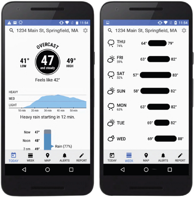 | Examples of the earlier Dark Sky interface showing the at-a-glance design of the main screen (left) and the results of scrolling daily entries. (Examples culled from Internet images.) |
How can we move in that direction? Insiders need to cultivate a habit of continually asking not "What's wrong with their interface/system/model?" but rather "What is wrong with ours?" Insiders need to ask not "How can we put our stamp on this?" but rather "How can this acquisition influence our stamp?" We can ask not "What does the spec sheet/PowerPoint slide say?" but rather "What is it like to use this?" and "What is it like to use this in particular contexts?"
Third, we must continue to think about policy. We are pretty far down a track in the world that treats everything about the Internet as a set of purely economic propositions, owned by a very small number of dominant players. But there is an alternative view that treats the Internet as a utility. Thinking about this may give people the strength to resist seeing as inevitable the way the Internet is currently constructed, or even somehow as morally superior because it has so little public regulation. With apologies to Bernie Sanders, we can say, "It's okay to be angry about the Internet."
Prospects for culture change can seem bleak, but they do happen. Fifteen years ago, we published a paper drawing attention to the values in games, like acompetition, that were not part of the dominant "first-person shooter" scenario [3,4]. We built on Opie and Opie's [5] observation that, across cultures and throughout time, people have spent more time negotiating how to play street and playground games than actually playing them, rarely keep points in a strict way, and are often more concerned with keeping the game going than with winning. That is, most people do not seek absolute domination most of the time. Subsequent to this paper (but coincidently), culture did change. Corporations sprang up that promoted a wider variety of online games with a greater emphasis on self-challenge, including most recently Spelling Bee and Wordle. In a related call for culture change, we wrote about the prospects of creating computing environments that reflect our better natures and thereby encourage us to be the people we aspire to be [6]. This hasn't happened yet. But it might, especially if we continue to appreciate and focus on examples like Dark Sky that, even in small ways, surround us with the potential for agency and pleasure. The Dark Sky of the future might become something else, perhaps a New Dawn? Or not. It's up to you, the designers of tomorrow.
References
1. Harrison, S., Tatar, D. and Sengers, P. The three paradigms of HCI. Proc. of CHI 2007. ACM, New York, 2007.
2. Yes, it is a real thing sold by Hammacher Schlemmer for $800: https://www.hammacher.com/product/only-complete-swiss-army-knife
3. Tatar, D., Lee, J.S. and Alaloula, N. Playground games: A design strategy for supporting and understanding coordinated activity. Proc. of the Conference on the Design of Interactive Systems. ACM, New York, 2008, 68–77.
4. Tatar, D., Lin, S. and Lee, J.S. Playground games and the dissemination of control in computing and learning. In Educating Learning Technology Designers. DiGiano, S. Goldman, and M. Chorost, eds. Lawrence Erlbaum Associates. Mahwah, NJ, 230–257.
5. Opie, I. and Opie, P. Children's Games in Street and Playground. Oxford Univ. Press, Oxford, U.K., 1969.
6. Tatar, D. Reflecting our better nature. ACM Interactions 21, 3 (May–June 2014), 46–49; http://interactions.acm.org/archive/view/may-june-2014/reflecting-our-better-nature
Authors
Recently retired from Virginia Tech, Steve Harrison was director of the human-centered design program, associate professor of practice in computer science, and codirector of the social informatics area of the Center for Human-Computer Interaction. Previously, he was a research scientist at the Xerox PARC. [email protected]
Recently retired, Deborah Tatar was a professor in computer science and, by courtesy, psychology at Virginia Tech, as well as director of the Association for Women in Computing. Previously, she was a research scientist at Xerox PARC. [email protected]
 Copyright 2023 held by owners/authors
The Digital Library is published by the Association for Computing Machinery. Copyright © 2023 ACM, Inc.


Post Comment
No Comments Found