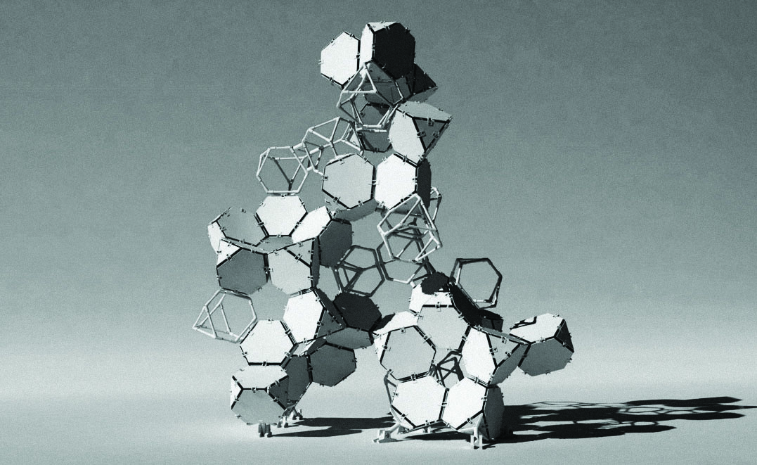
cringeMACHINE
Issue: XXIV.4 July-August 2017Page: 16
Digital Citation
Authors:
Andrei Smolik, Robert Cameron
Describe what you made.
cringeMachine is a temporary installation composed of 20 truncated tetrahedrons that respond to the sounds around it. Our initial idea was to create a transformable sculpture made of self-similar parts that could be assembled into a variety of configurations. When you make sufficient noise around it, the cringeMachine sends a pulse of lights through a sequence of LEDs built into its component parts, varying in color and intensity.
 |
Computer rendering of original design concept. |
What materials and tools did you use?
We used thin twin-wall polypropylene sheets for solid LED component cladding, laser-cut plywood for the flexible hinge connectors, pine wooden dowels, and 3D-printed pronged fittings for the hollow structural frame. The use of expensive-looking (but in reality, dirt-cheap) white plastic in combination with natural timber tones created an interesting visual blend of materials reflecting the combination of precisely machined and meticulously hand-crafted construction techniques.
 |
Assembling flexible hinge joints. |
Did anything go wrong?
Halfway through the process, we realized that using hinged friction joints was not going to be structurally viable while also maintaining the modularity of the structure at the desired scale. The way we got around it was by fixing hinged joints into position and then settling on the most stable configuration of parts: a truncated dodecahedron. This is interesting since some naturally occurring tessellations (like crystals) tend to create forms that are similarly stable.
 |
Detail of cell joint and sound sensor. |
What was the biggest surprise in making this?
It was interesting to discover that even making simple interactive systems could elicit great interest and response—the sculpture became more and more like a reflector of the performers in the space surrounding it rather than a singular sculptural statement. Its reaction to sound often became obfuscated, appearing more like a flickering candle with a mind and thoughts of its own. The interaction felt natural and less mechanical than what we were initially expecting.
 |
Assembling the ring module. |
The interaction felt natural and less mechanical than what we were initially expecting.
How would you improve on this if you were to make it again?
In terms of form, we would definitely redesign the friction hinge connectors; though their complexity added to the overall aesthetic effect, they potentially could have been simplified, making them easier to fabricate. Interlocking them mechanically would also increase overall stability and potentially fulfill our initial aspiration of making the structure modular. We would also like to expand on the ideas of the modularity of responsiveness and structural modularity—making components independently addressable as well as potentially building awareness and simple behaviors into individual cells.
 |
Detail of hollow-cell and solid-cell joint. |
 |
Detail of completed sculpture responding to sound. |
 |
Lighting tests with partially constructed sculpture. |
Andrei Smolik, Curtin University
Robert Cameron, The University of Western Australia, [email protected]
http://www.thedeadpixelproject.com/subpages/research/cringeMACHINE.html
Copyright held by authors
The Digital Library is published by the Association for Computing Machinery. Copyright © 2017 ACM, Inc.


