Thinga.Me
Issue: XXIV.6 November + December 2017Page: 14
Digital Citation
Authors:
Daniel Harrison, Richard Banks, Tim Regan, Martin Grayson
Describe what you made.
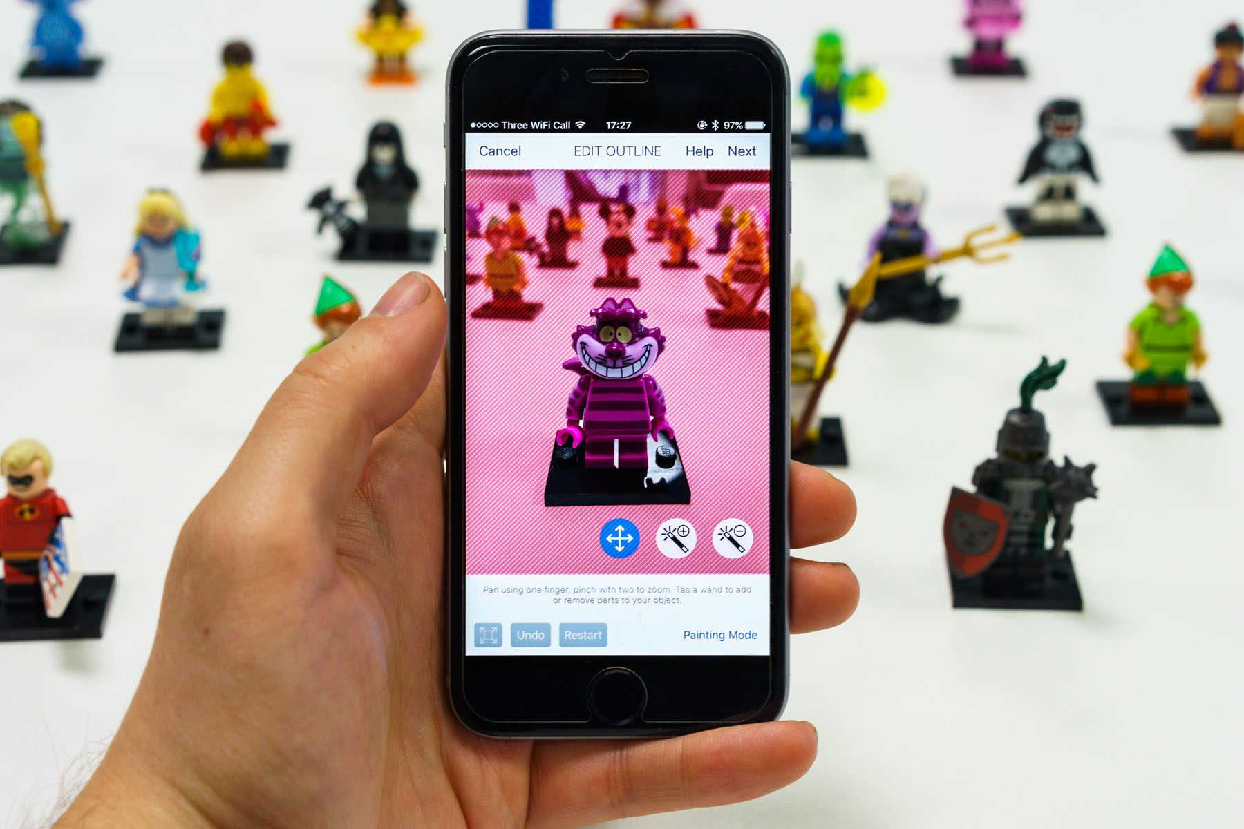
Collecting has been practiced for hundreds, if not thousands, of years. Collections of purely digital content such as MP3s, Kindle books, and even items collected in computer games are now common, as are digitized museum and gallery collections. However, little is known about how people might react to, and interact with, personal digital collections of actual physical objects. To explore this area of digital-physical collecting, we developed Thinga.Me, an app that allows users to digitally "collect" the things they see in the real world. With Thinga.Me, users take photographs of their items, which they can easily cut out and arrange in stylized digital collections. These can then be shared with others. By removing items from the background, the app gives them depth, creating the illusion of a physical object and giving users the sense of carrying their items with them in their pocket.
 |
Some initial wireframes of the app. |
What for you is the most important/interesting thing about what you made?
Using Thinga.Me as a research vehicle, we were able to compare and contrast people's sense of their physical collections with a literal, digital equivalent. People were inspired by the app and put a lot of effort in, particularly with displaying their physical collectables.
 |
Football helmets collected by one of our participants. |
Did anything go wrong?
The first version of the application relied on computer-vision technology to recognize and appropriately tag the items in pictures. Unfortunately, this system didn't work as expected and often made interesting and unforeseen suggestions, such as proposing to tag a scrunched-up ball of paper as "hermit crab."
 |
The Thinga.Me application. |
What was the biggest surprise in making this?
People were really engaged! We invited 800 people to test the app and within three months they had collectively amassed over 5,500 items in more than 650 collections—an average of almost seven items per user. One user alone collected over 600 items in the app. The biggest surprise for us was the range of curious collections people created and the huge amount of effort they put in.
 |
The Thinga.Me team. |
Was there anything new for you in the making process, materials, or something else that you can tell us about?
The algorithm we used to segment the "thing" from the background, GrabCut, is relatively old technology, first described in ACM Transactions on Graphics in 2004 and the basis of PowerPoint's background-removal tool in Office 2010. However, it was clear to us that it could form the centerpiece of our app: The algorithm provides the magic that pops the thing from its background. We learned that old algorithms can still appear novel and magical if properly showcased in an app. GrabCut sometimes gets the initial segmentation wrong; factors such as the lighting conditions affect the quality of the results. We put a lot of design work, and many iterations of our prototype into getting the user interaction right. This seems a fruitful area for further work—helping people to understand the limitations of the AI algorithms that they use and how to provide the best level of feedback to steer those algorithms to success.
Daniel Harrison, University College London and Microsoft Research Cambridge
Richard Banks, Microsoft Research Cambridge
Tim Regan, Microsoft Research Cambridge
Martin Grayson, Microsoft Research Cambridge, [email protected]
Copyright held by authors
The Digital Library is published by the Association for Computing Machinery. Copyright © 2017 ACM, Inc.

